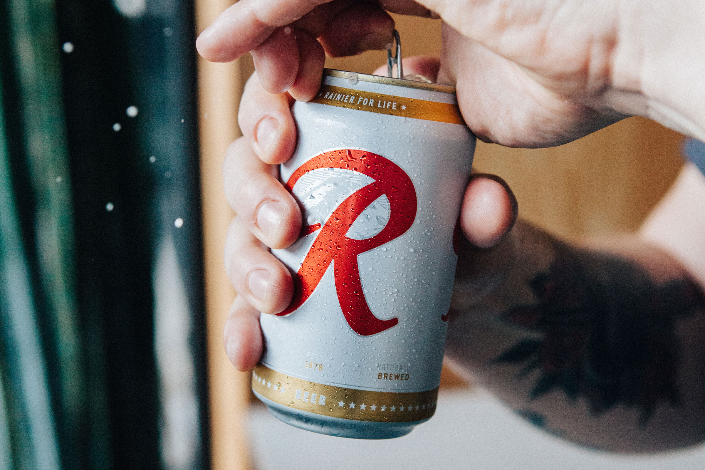
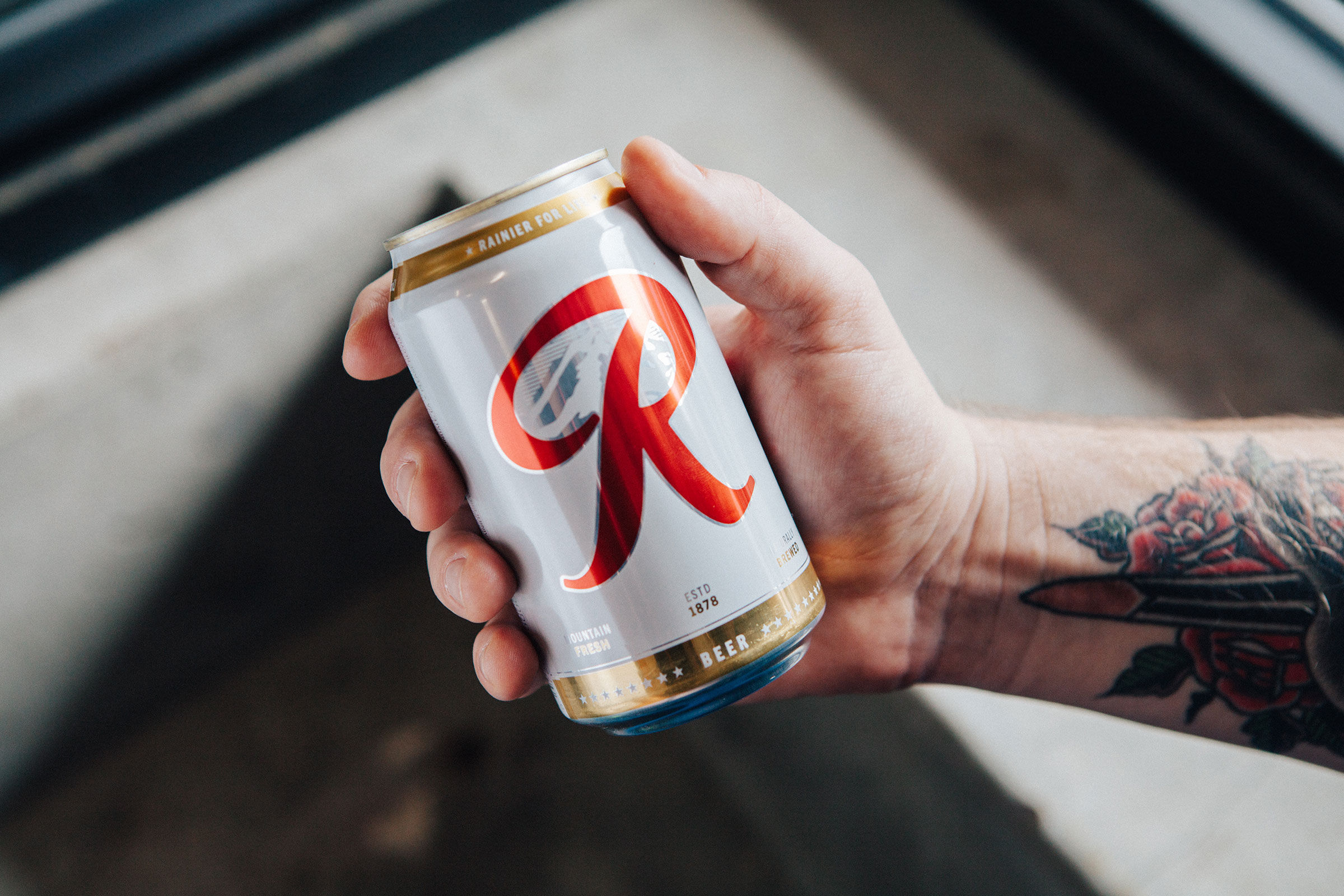
Rainier Beer Packaging
In the Pacific Northwest, Rainier beer is as legendary as the mountain it’s named after. It’s been the unofficial official beer of the Northwest for over a century, and they wanted help staying that way.
Branding
Identity
Design
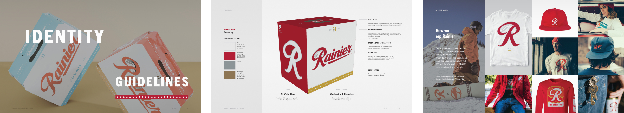
Packaging
Prototyping
Identity
Design
Packaging
Prototyping
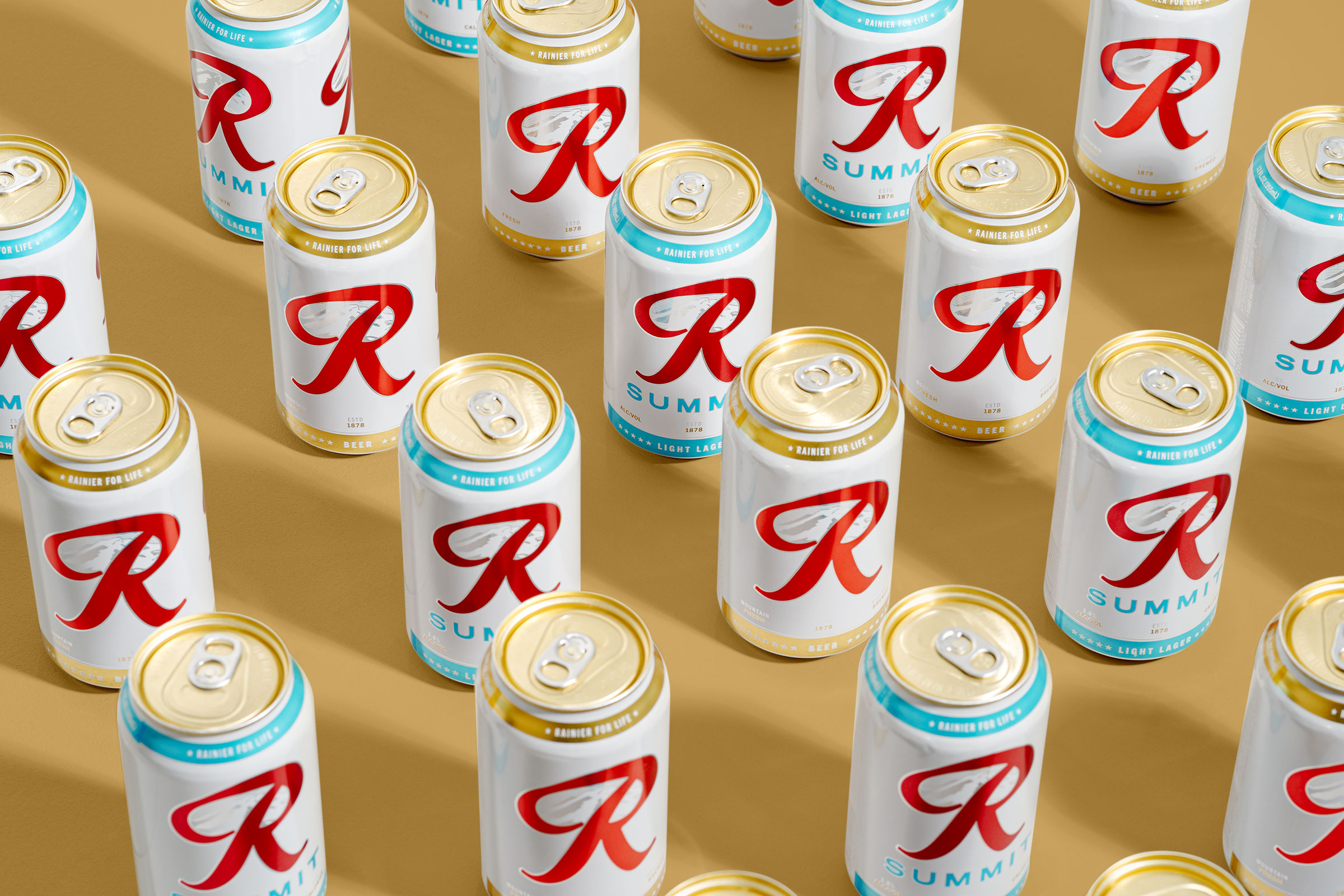
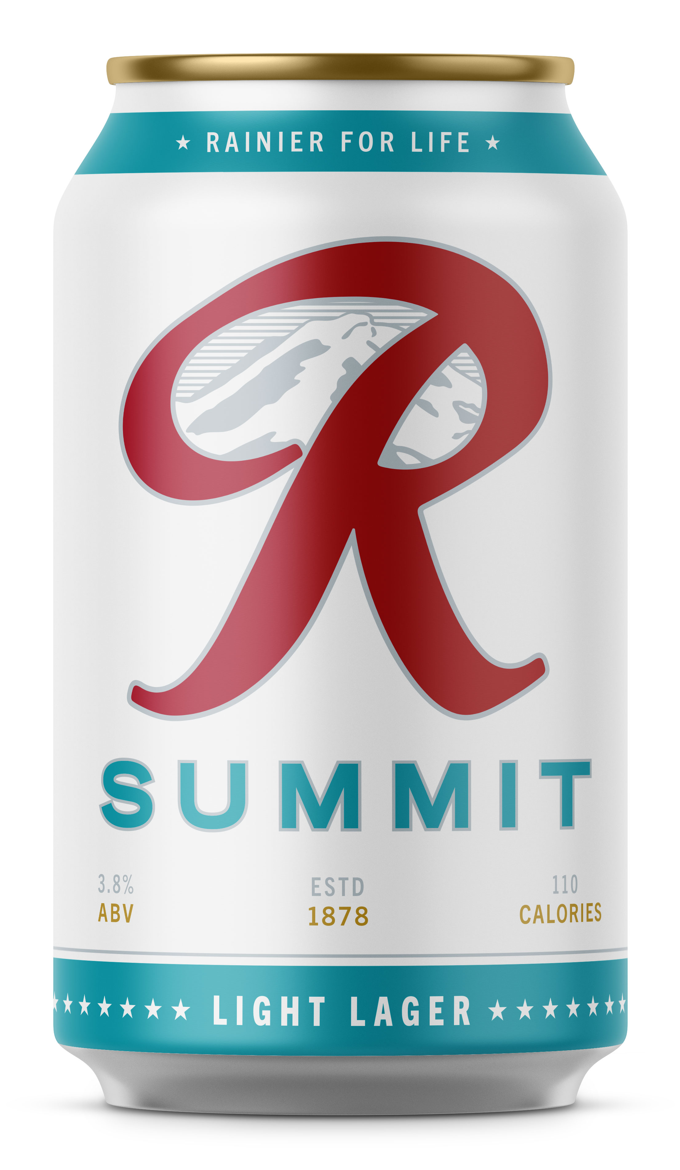
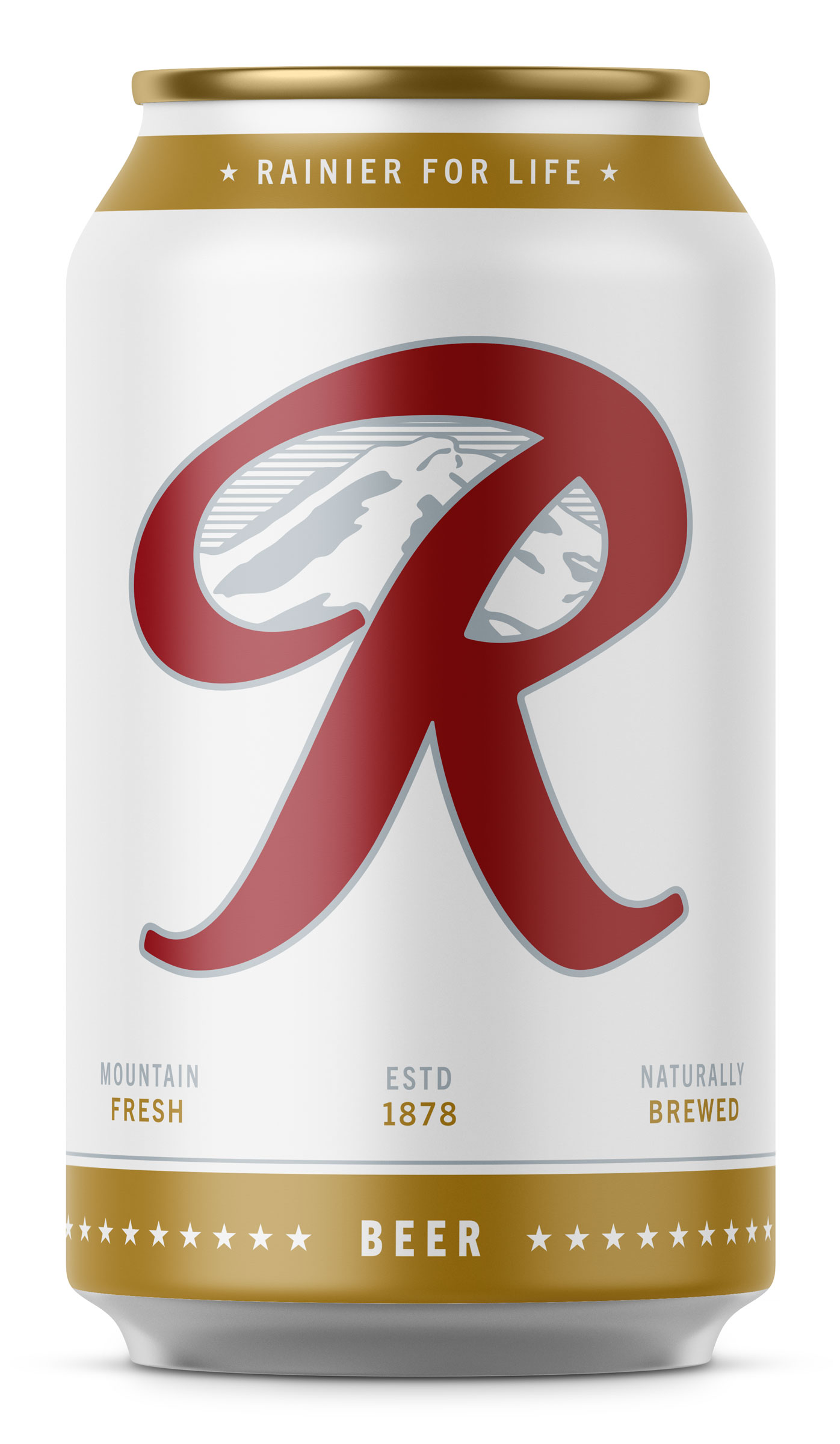
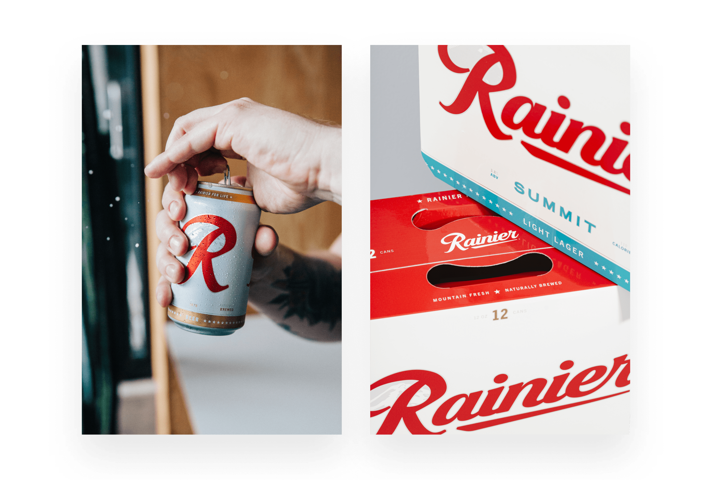
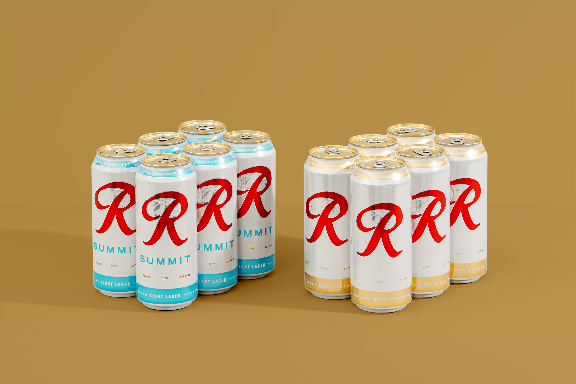
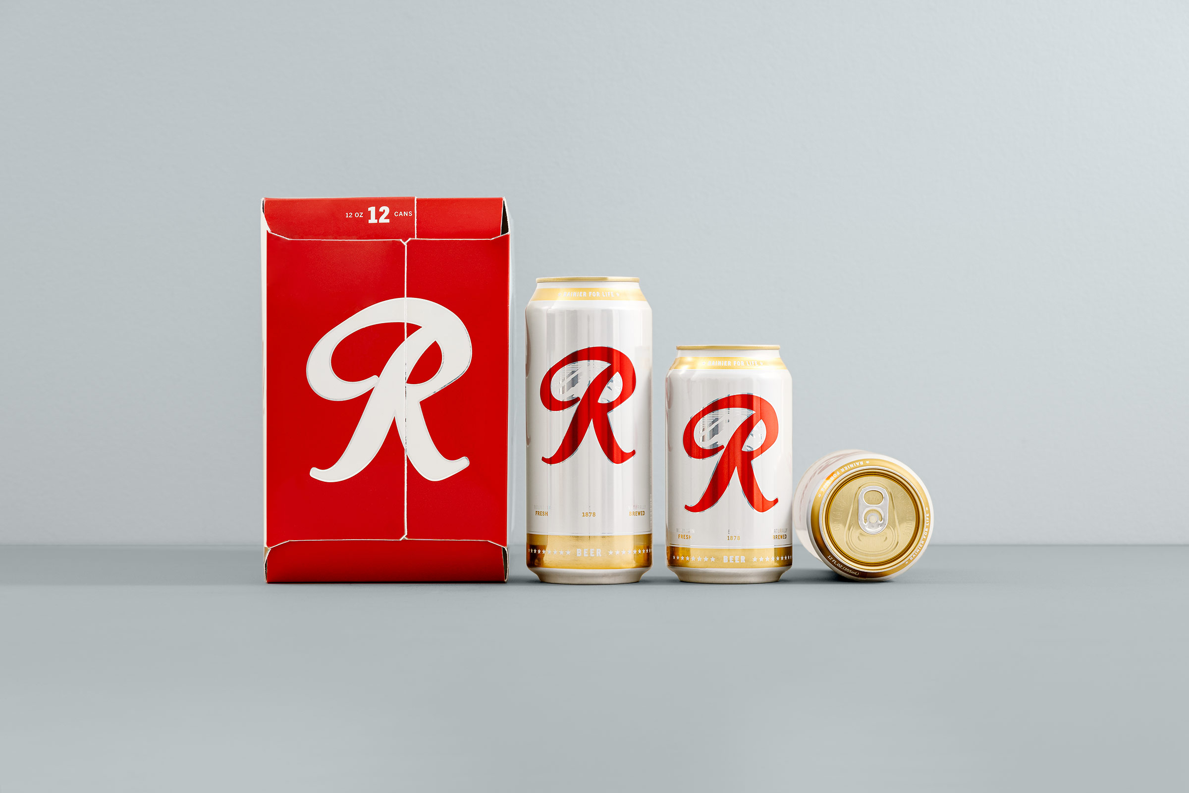
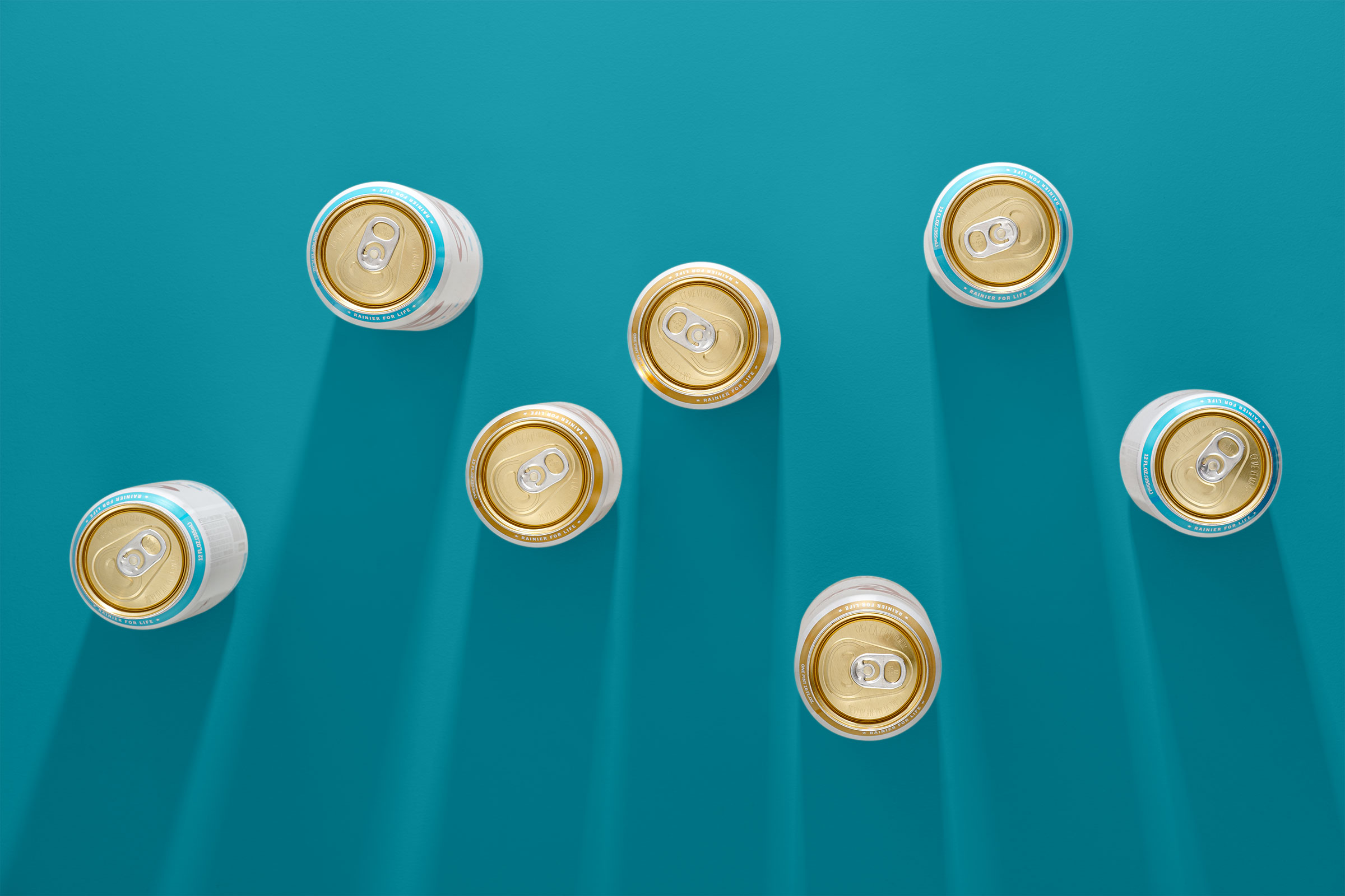
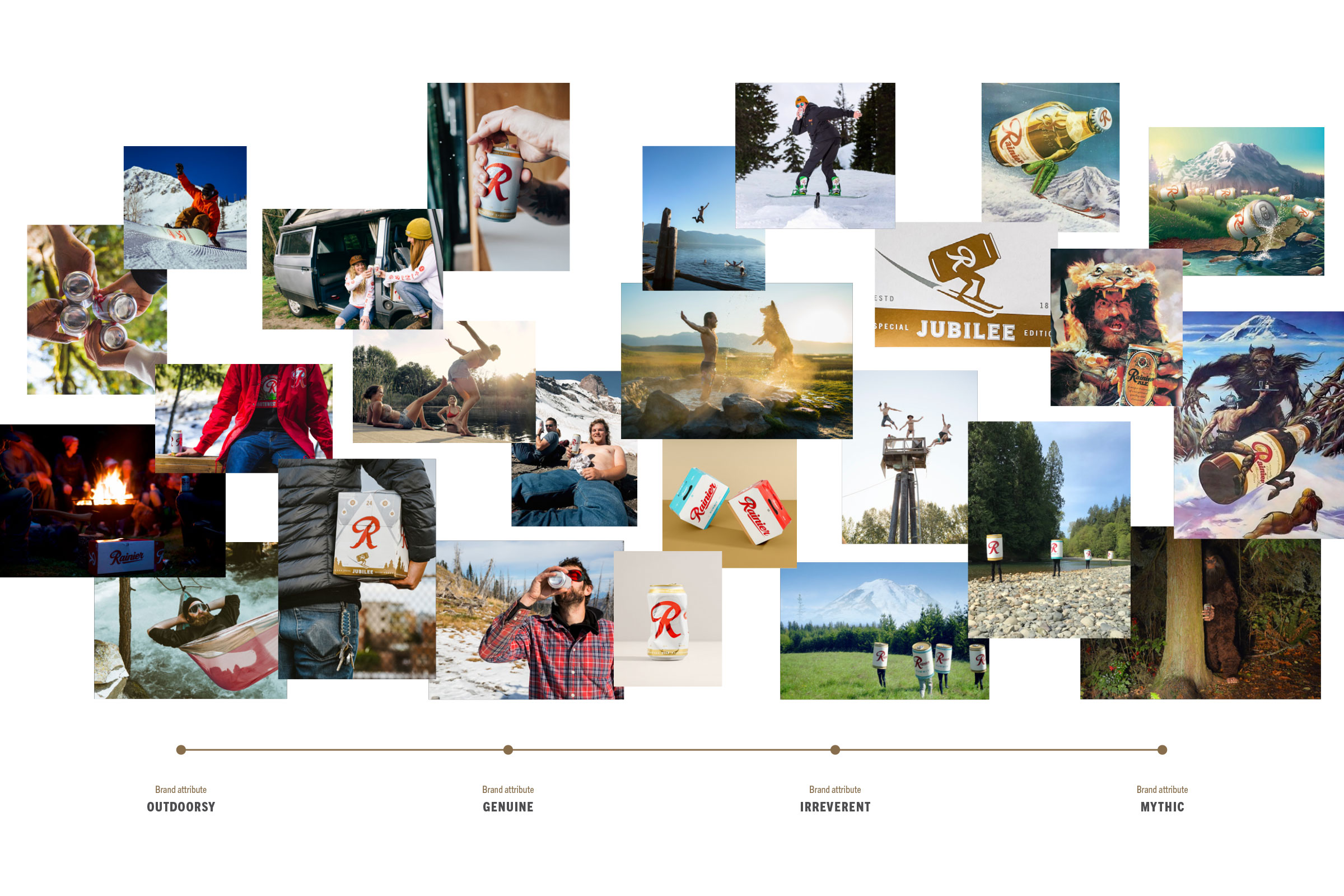
After wrapping up Rainier’s new brand strategy and identity, I lead a complete revamp of their iconic packaging. We focused on modernizing their appeal to the northwest’s outdoorsy lifestyle, creating a design system for new products, and doubling down on their most important asset, the big red R.
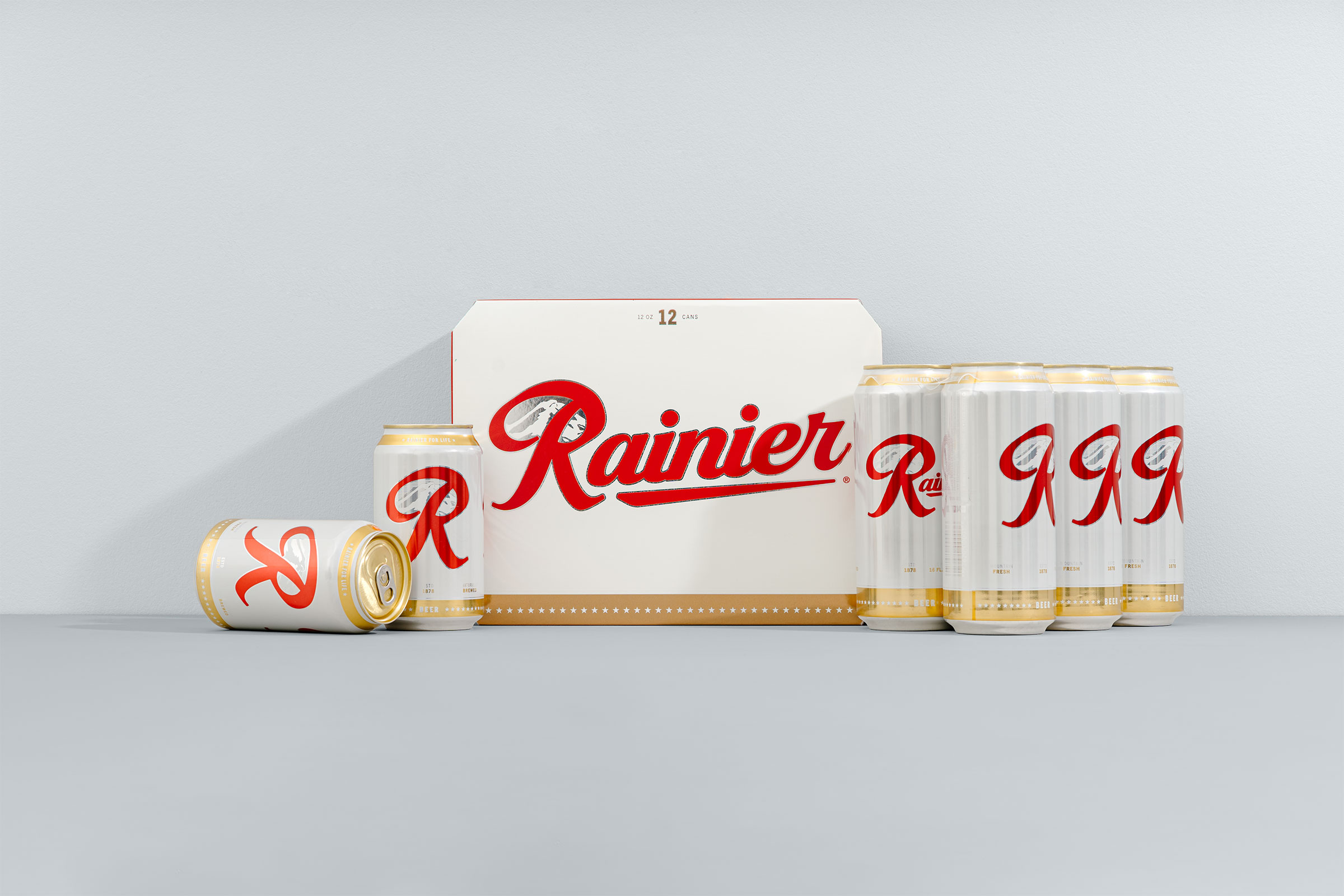

A classic refreshed.
Rainier has been growing like crazy over the last decade, and this redesign ensured they can continue growing into the next one. With new beers on the horizon, and a couple other secrets up their sleeve, I’ve been thankful to join them on this ride, and share a few beers along the way.
Team
Made while working at Parliament.
Calvin Ross Carl, Creative Director & Designer
Aaron Noah, Producer
Scott Snyder, Studio Photographer
Calvin Ross Carl, Creative Director & Designer
Aaron Noah, Producer
Scott Snyder, Studio Photographer
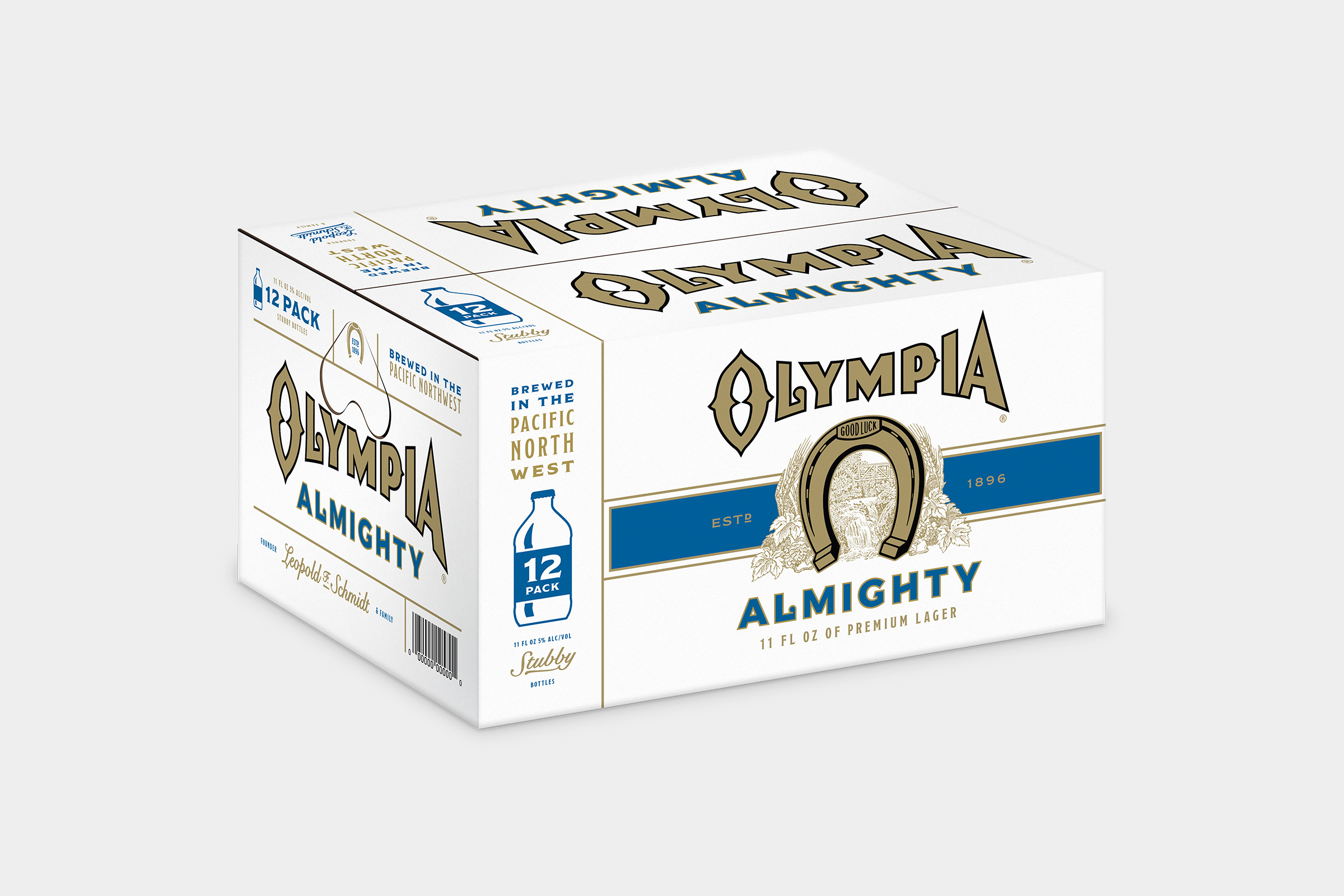
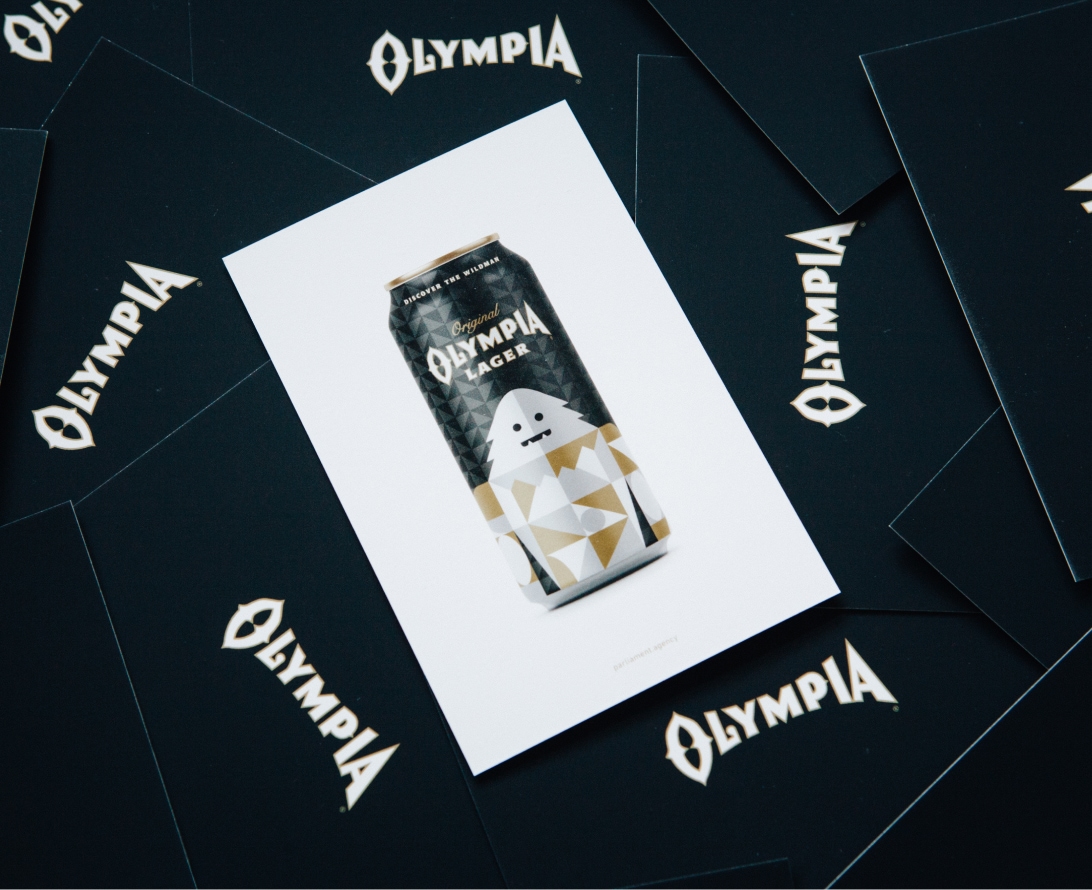
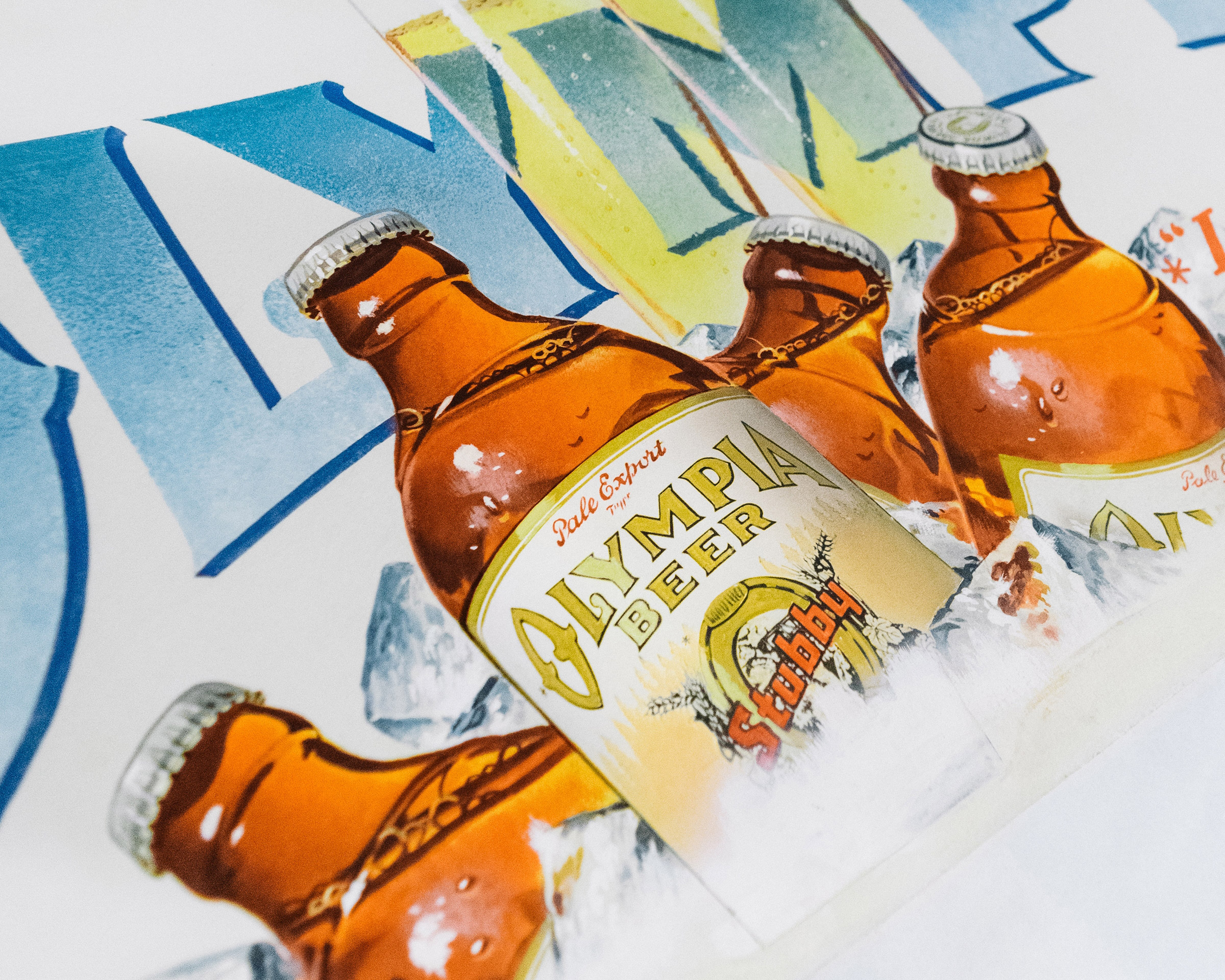
Olympia Beer Brand & Product Innovations
Over a century ago, a German brewmaster and explorer was on the impossible mission to brew the perfect beer. Yet after years of searching, he fulfilled his destiny by discovering the pure waters of Washington state—and so the Olympia Brewing Company was born.
Branding
Identity
Design
Packaging
Prototyping
Product design
Identity
Design
Packaging
Prototyping
Product design
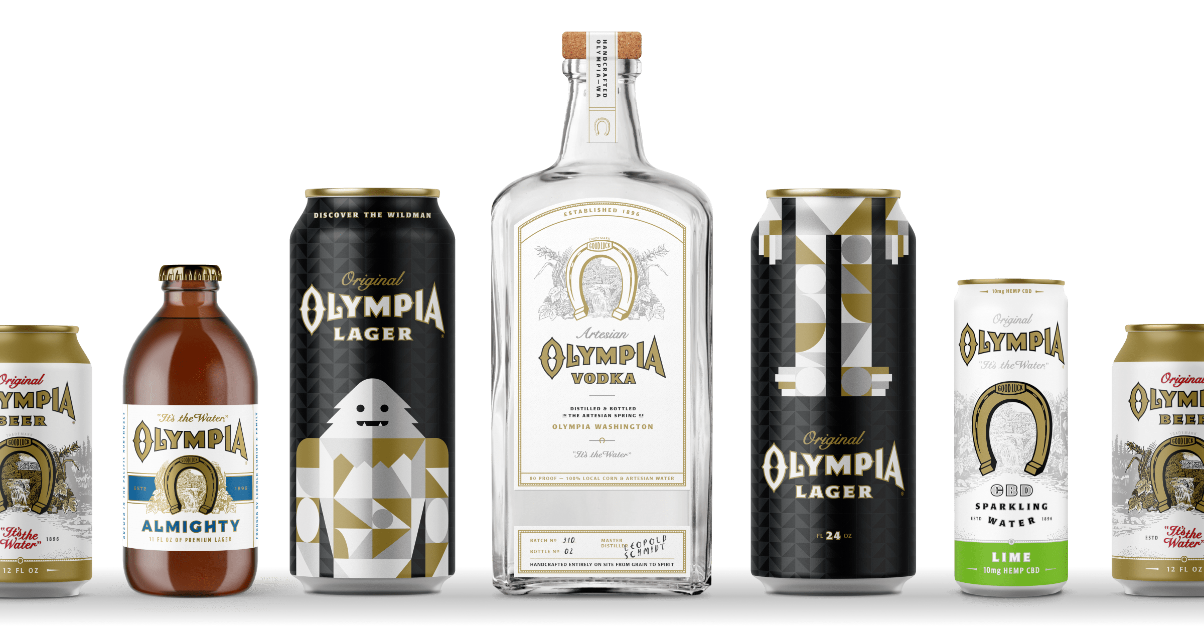
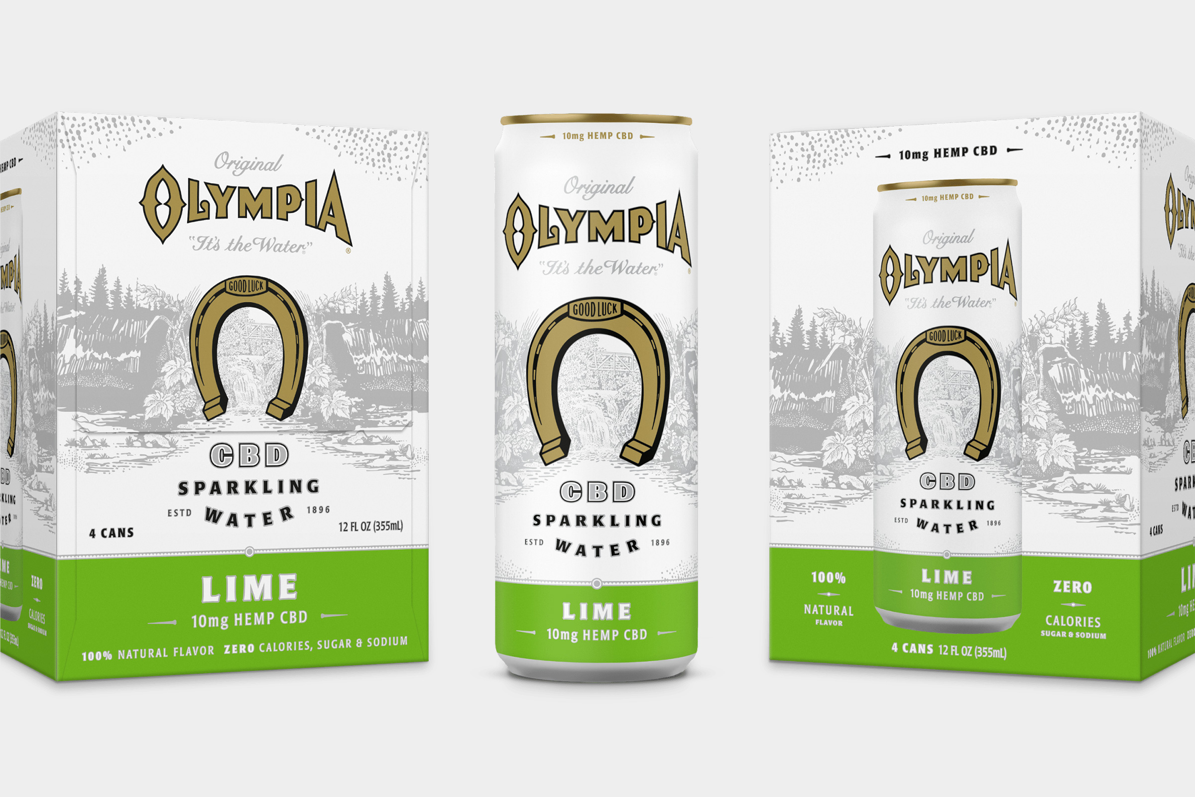
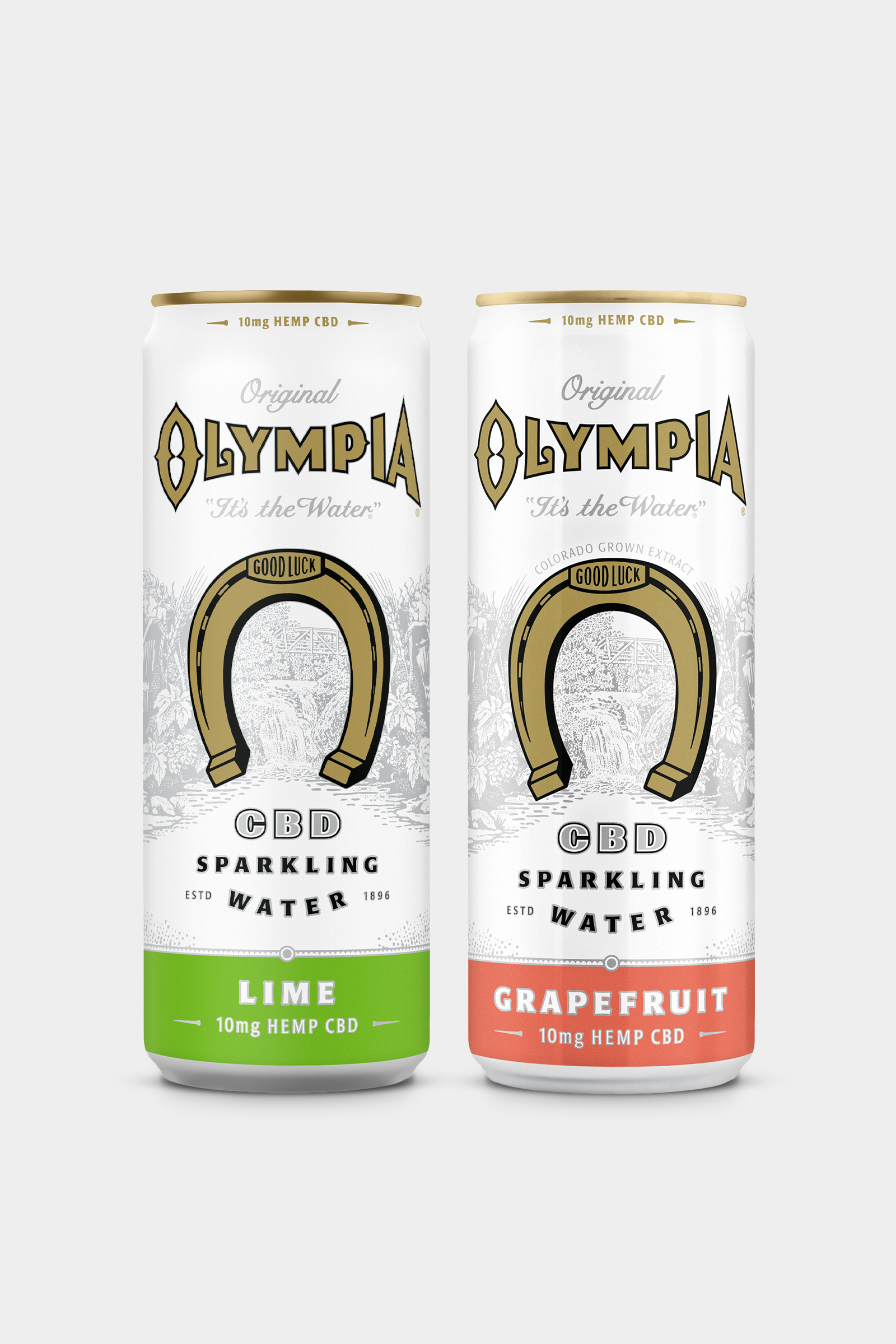
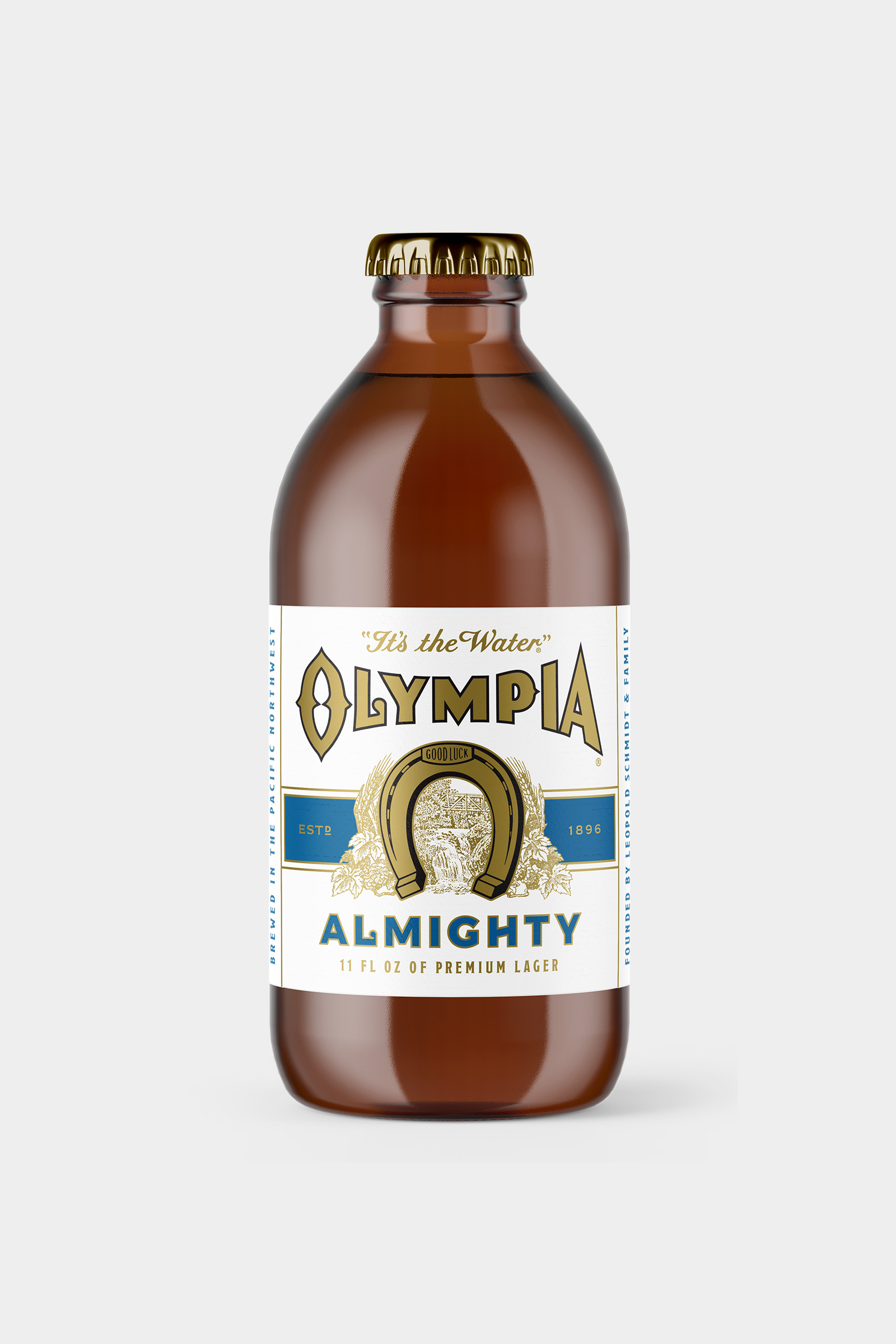
Over the decades, Olympia became more known for its low price than its adventurous beginnings. This changed when parent company, Pabst Brewing, decided to breathe new life into it. The challenge was to “premium-ize” the brand and bring it back to its authentic roots of exploration—which included creating and testing multiple new products.
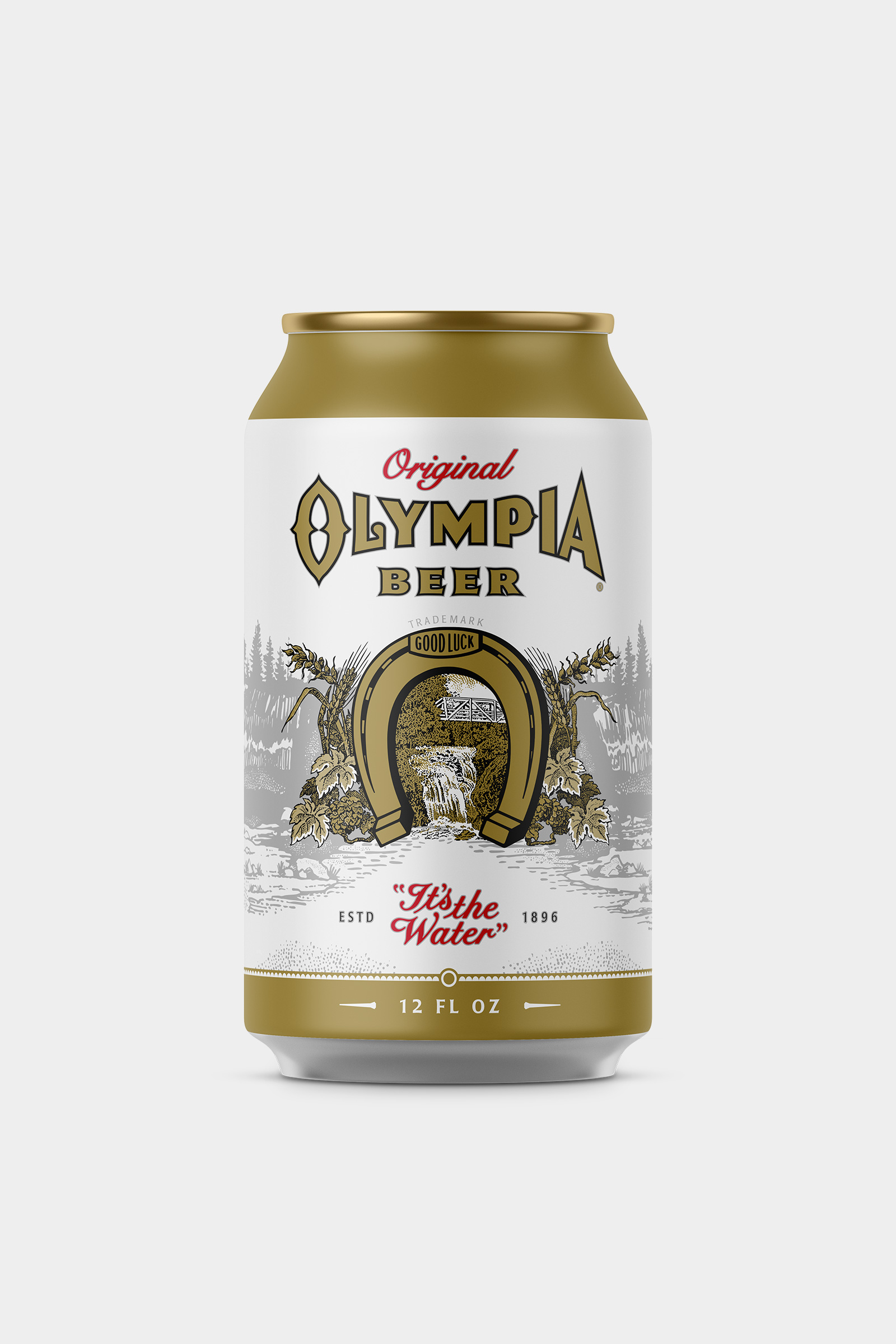
If it ain’t broke
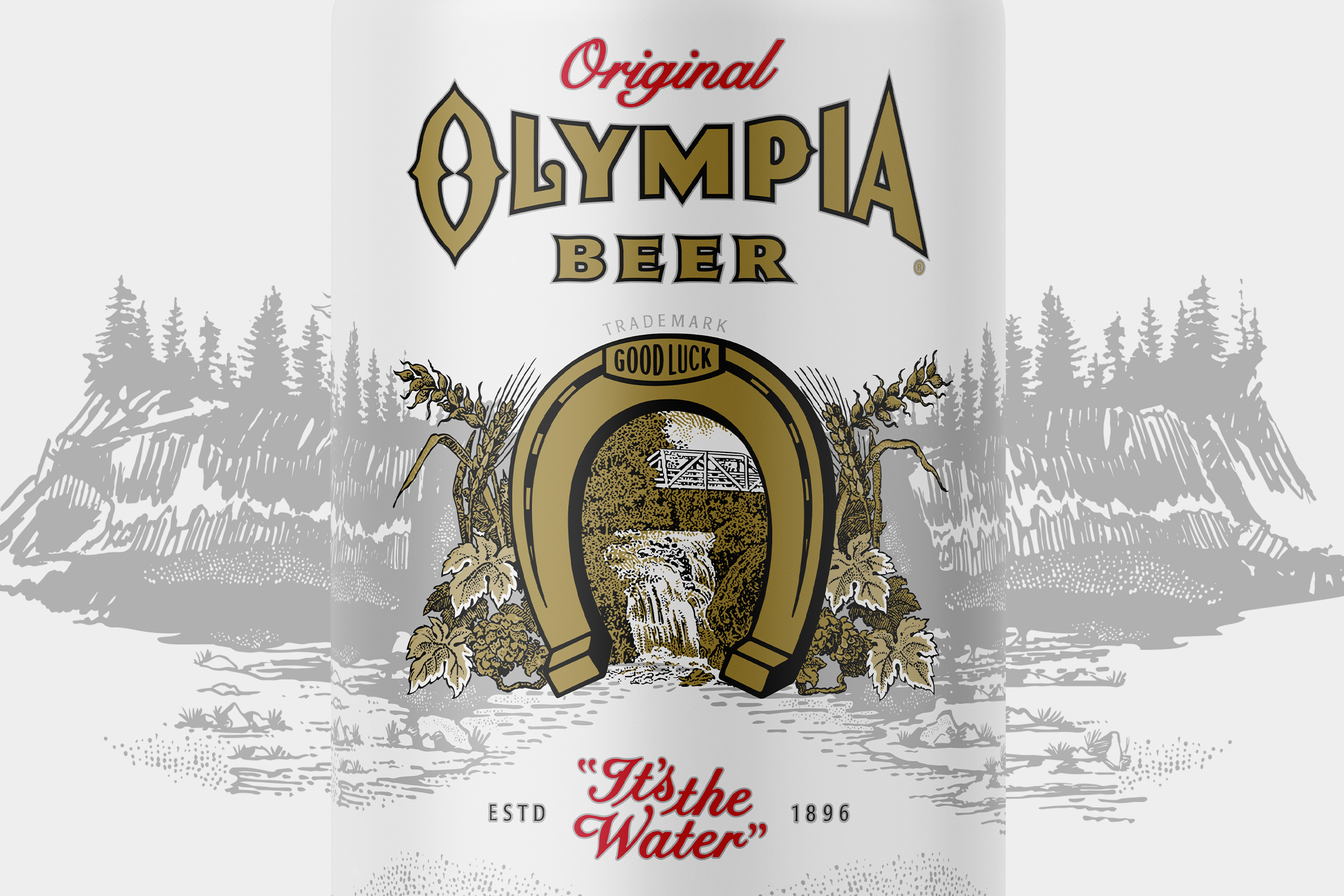
The original Olympia logo was a damn near perfect gem of Americana style design. It was dusted off, polished, and became the hub for the whole new brand identity.


From one to many
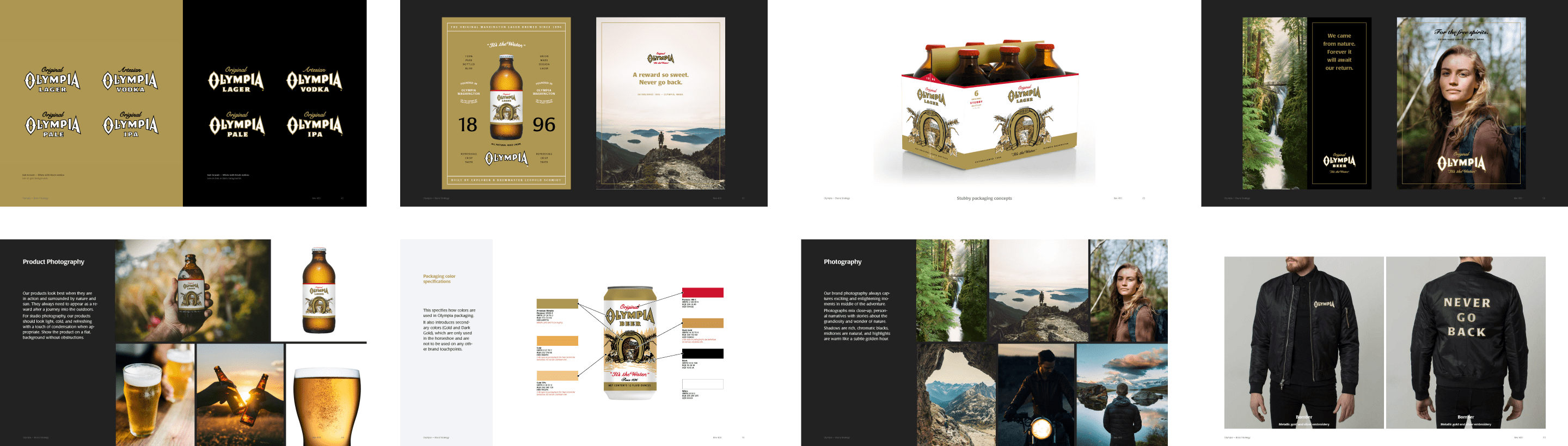
Olympia was a one-product company. Over years of working together, countless product innovations were created to extend their brand into new categories.


Committed to heritage
The goal was to bring the spirit of the Pacific Northwest back to Olympia. We helped scout locations for a new Olympia vodka distillery and hours were spent digging through the museum archives of the Schmidt family, the founders of Olympia Brewing.
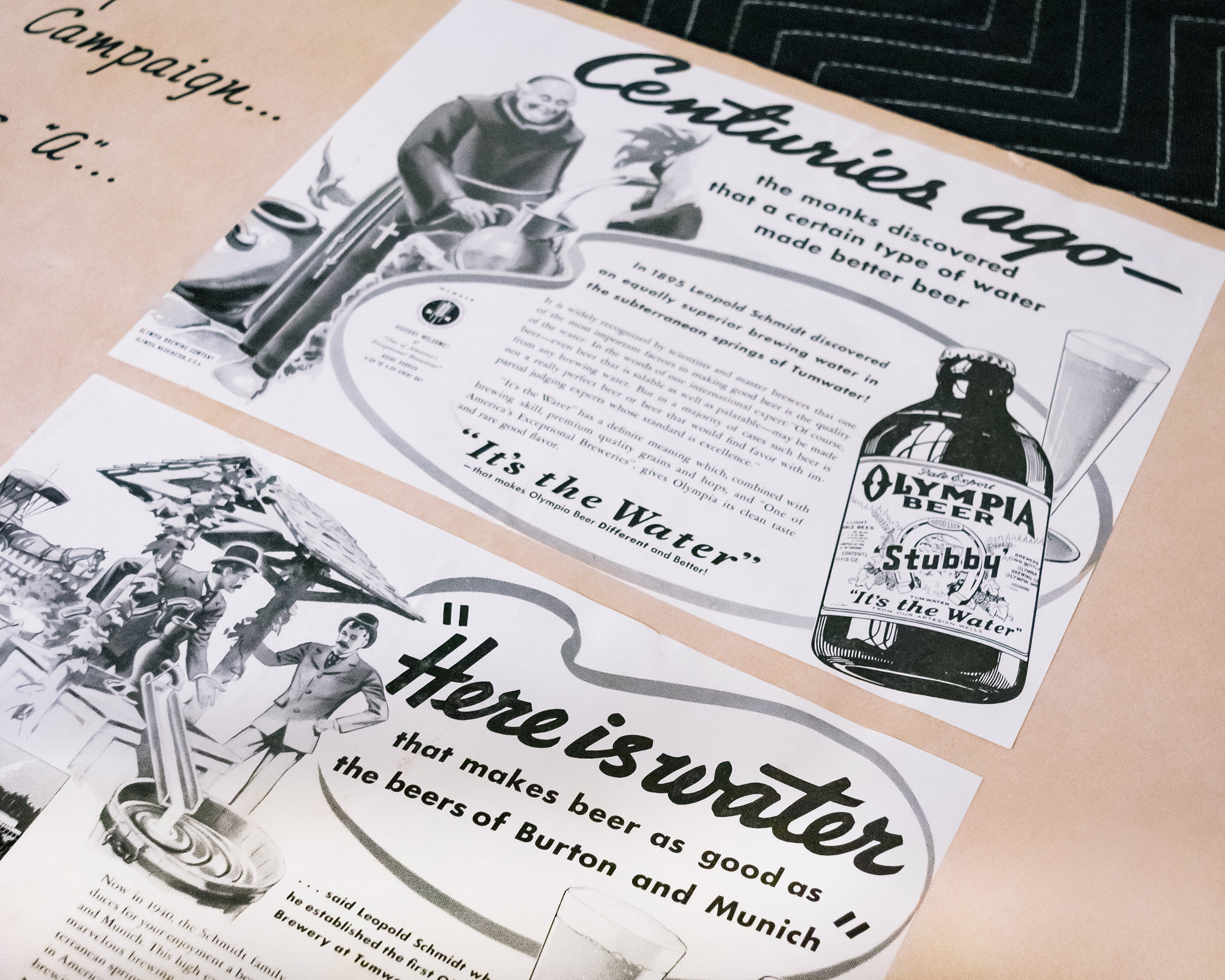
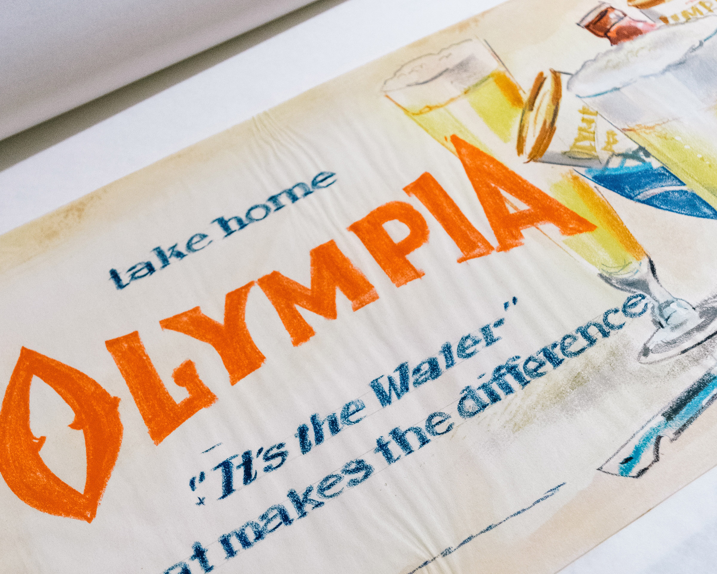

It’s the water.
Since working with Olympia, the brand has rediscovered its brand purpose and their new Artesian Vodka has sold out everywhere it lands. Thanks to the crew at Olympia for trusting such as classic brand when in the hands of another.
Team
Made while working at Parliament.
Calvin Ross Carl, Creative Director & Designer
Jono Stark, Designer & Photographer
Calvin Ross Carl, Creative Director & Designer
Jono Stark, Designer & Photographer
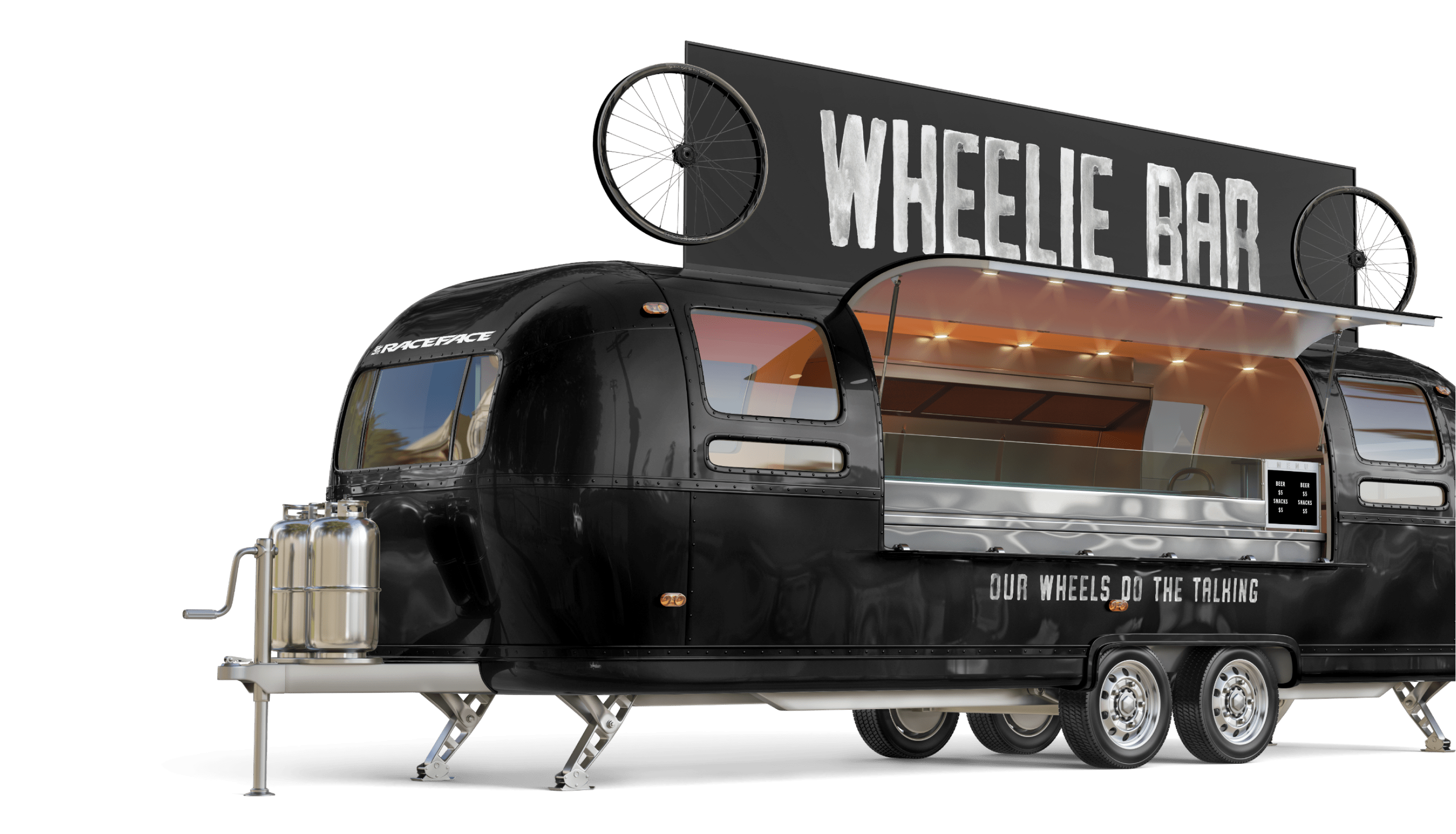
Race Face Wheels Campaign
Race Face is legendary in the mountain biking world. They were some of the originals carving trails on the North Shore, and their street cred (mountain cred?) hasn’t faultered since.
Campaign
Design
Concepting
Messaging
Standards
Design
Concepting
Messaging
Standards
However, Race Face was going where they’ve never gone before—they started making wheels. Riders are hard on their wheels and they’re even hard on the companies that make them. Race Face needed to take a stand, so we let their wheels do the talking.
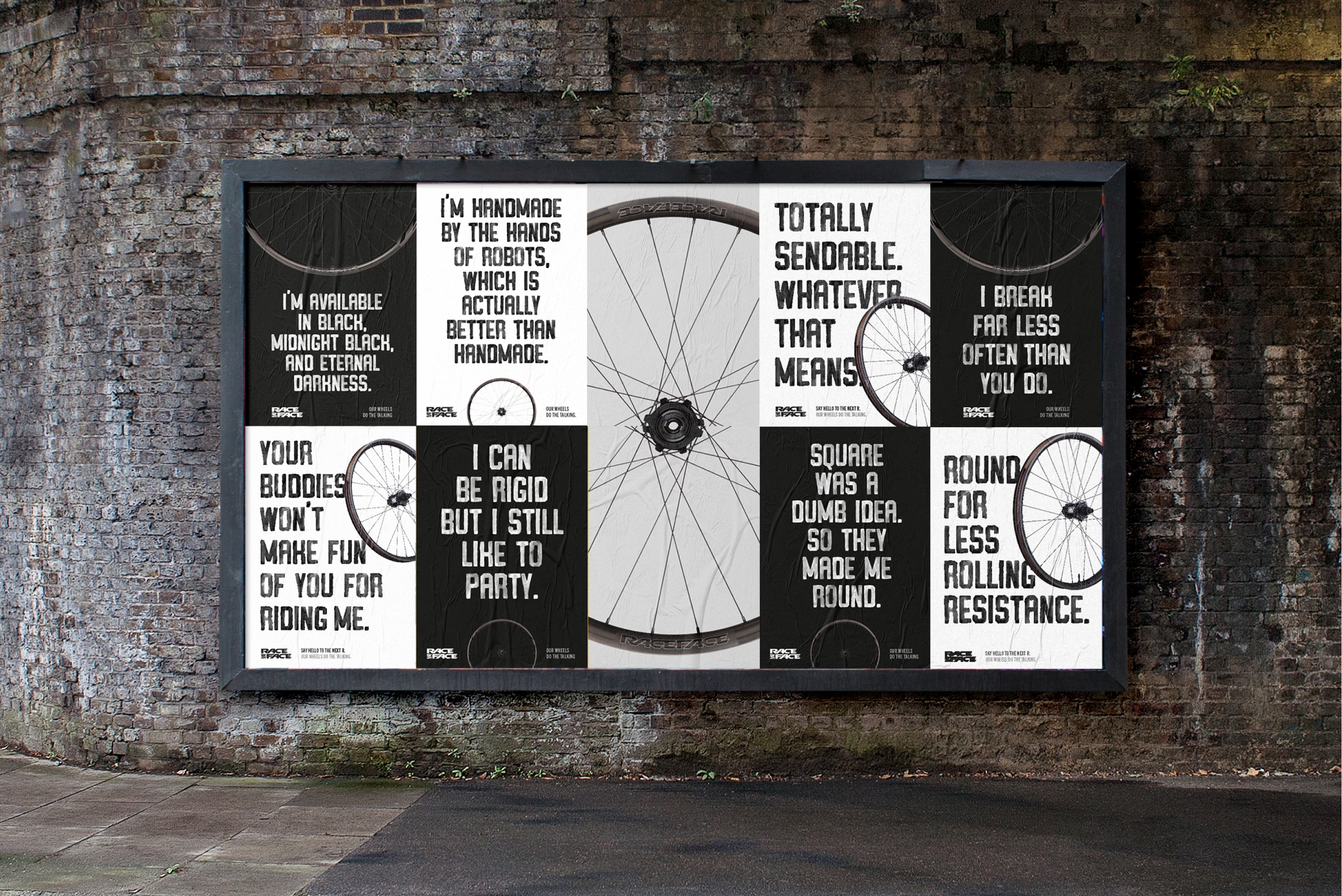
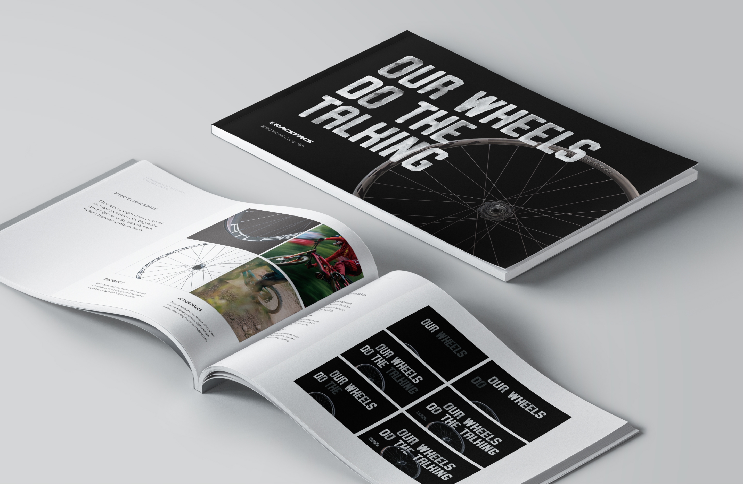
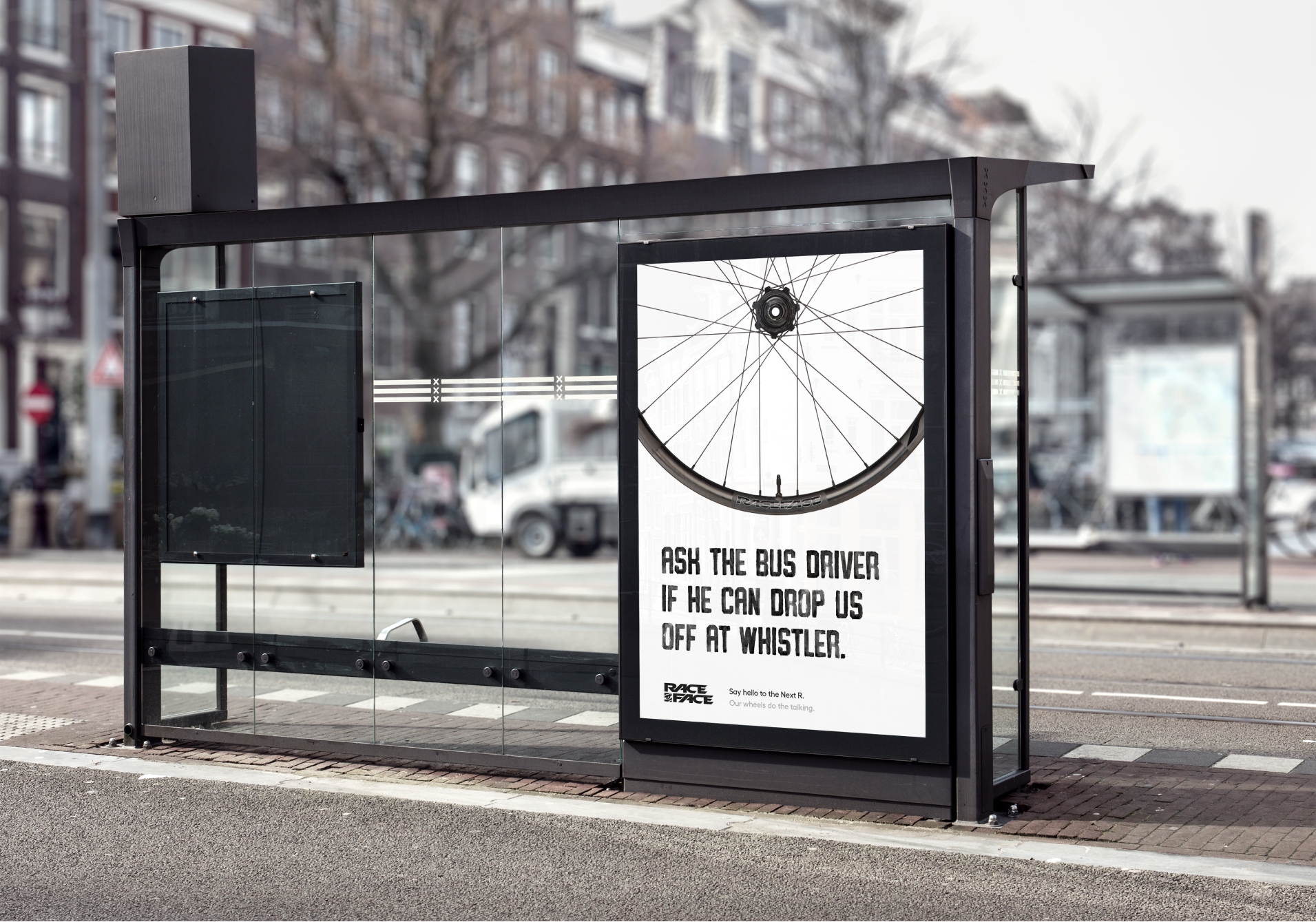
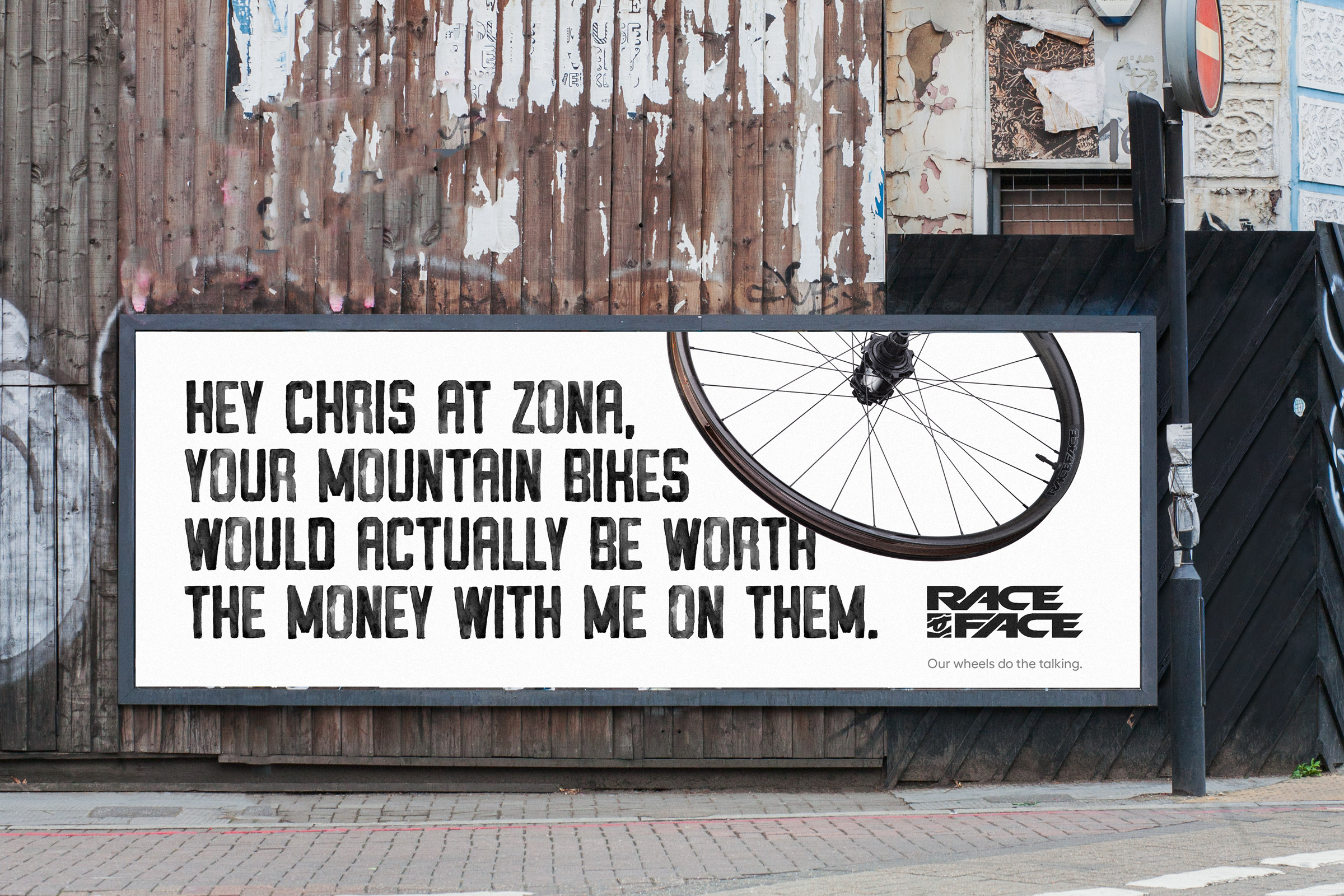
Our wheels do the talking
Race Face wheels have attitude, so we let the wheels say what’s on their minds. The campaign speaks directly to riders and industry insiders, whether they’re bombing down a hill or just walking down the street.

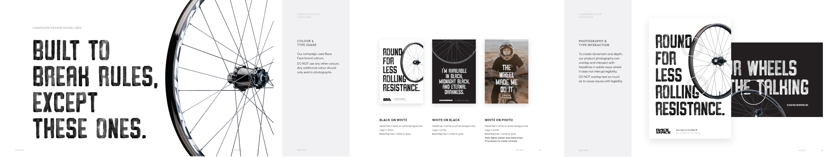
A toolkit for consistency.
One giant bible of campaign standards, hundreds of lines, dozens of executions, and clear design and messaging guidelines—this campaign was designed for consistency so Race Face’s internal team could take it and run with it.
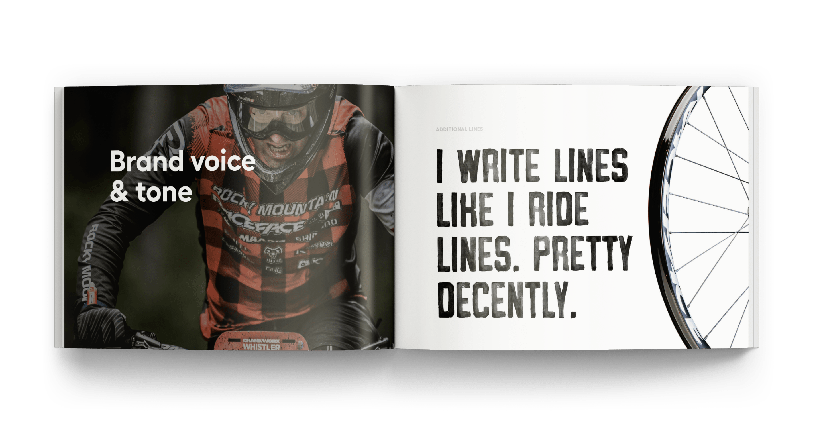
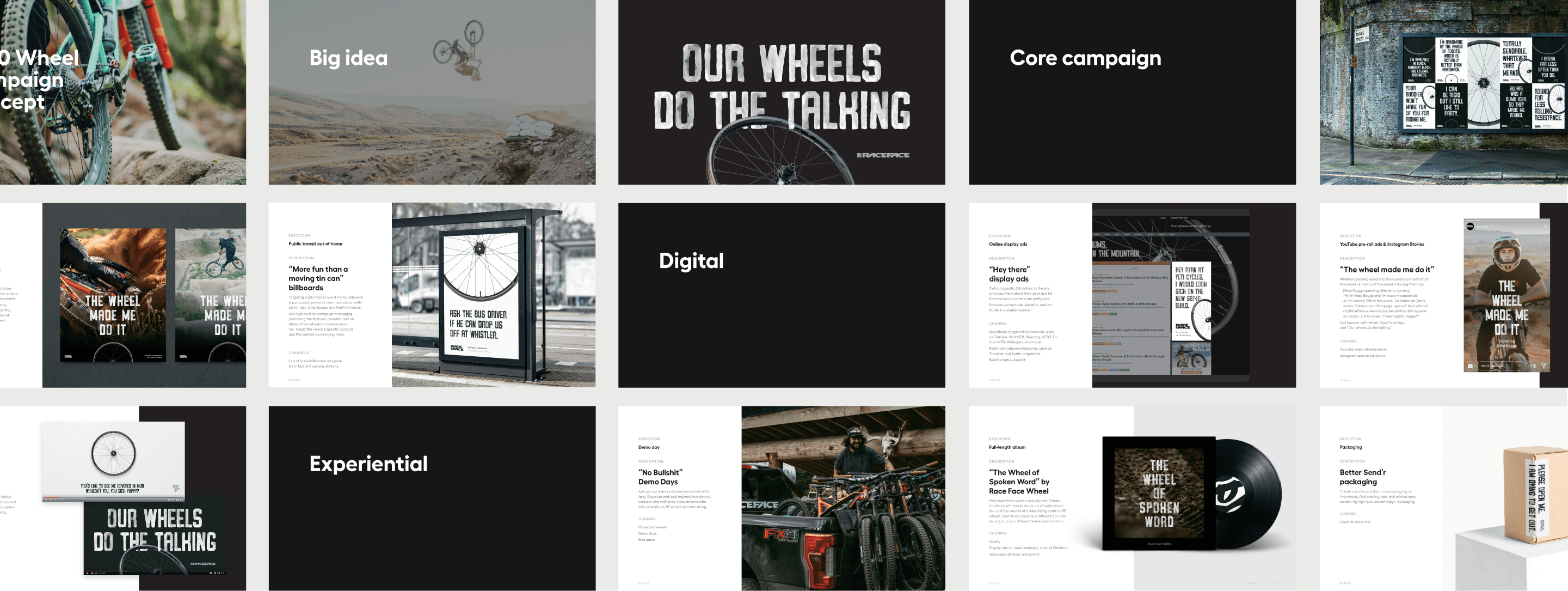
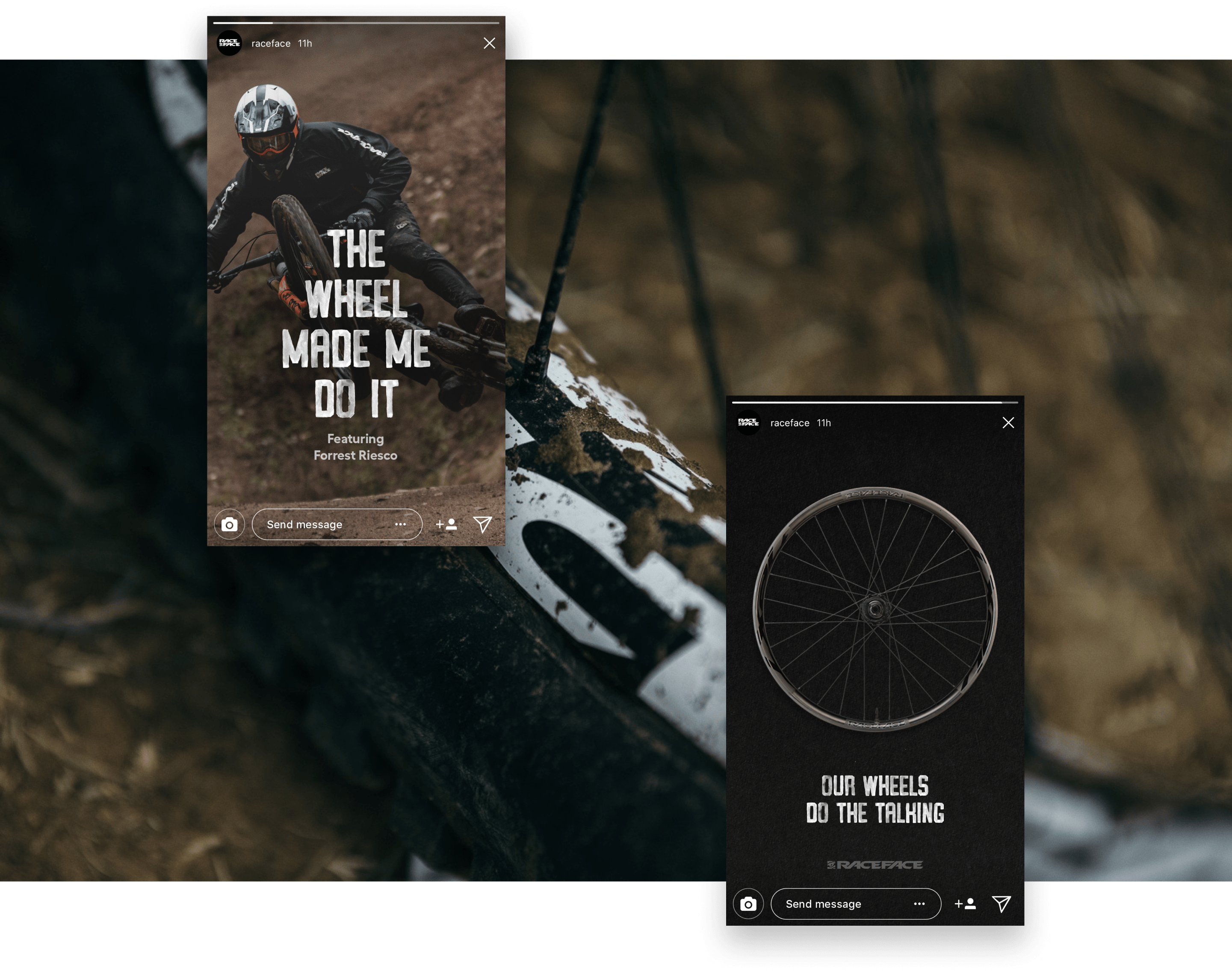
The wheel made me do it.
Race Face put all their marketing muscle behind this campaign for a whole year, and it got results. It officially put them on the map of mountain bike wheel manufacturers, and most importantly, it got sales. Look for one of these shit-talking wheels on a bike near you.
Team
Made while working at Parliament.
Calvin Ross Carl, Creative Director & Designer
Nick Hughes, Copywriter
Calvin Ross Carl, Creative Director & Designer
Nick Hughes, Copywriter
Rainier Brewing Branding
Rainier has been the crushable beer of choice for Pacific Northwesterners for over a century.
Branding
Identity
Design
Packaging
Brand extension
Identity
Design
Packaging
Brand extension
To ensure another century of dominance and carefree thrills in the outdoors, Rainier refocused their brand on what makes them great—being a carefree drink that gets your ass out of the city and into the outdoors.
The Big Red R is iconic
There is only one rule: do not fuck with the Big Red R. It’s been there since day one, and it’ll be there when we’re all dead and gone.
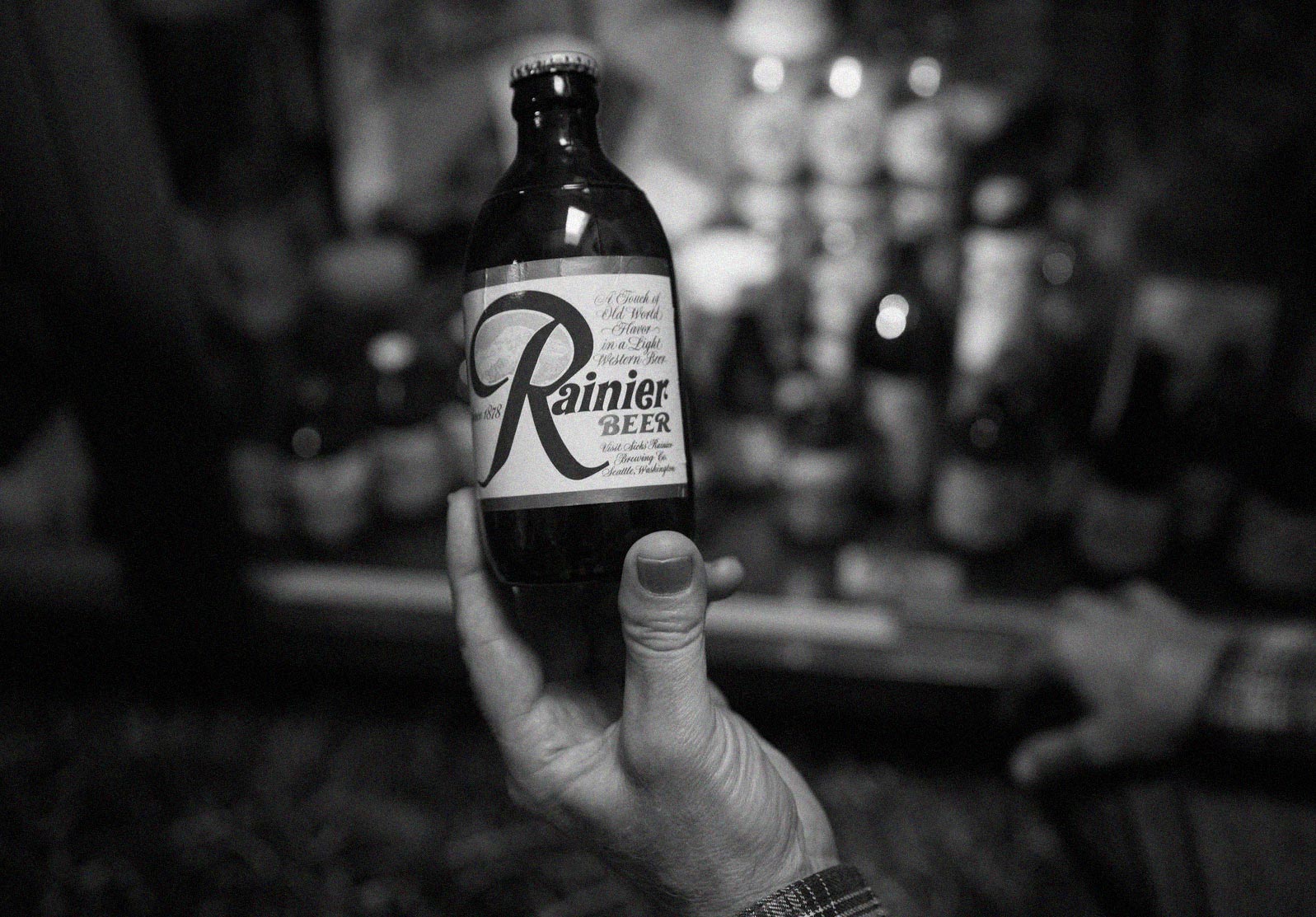
The 1960s Rainier stubby
New siding on an old house
So the Big Red R stayed, and the logo was changed to feel like a modern version of the classic beer it has always been.
Seriously not serious brand attributes
As long as we’re breathing, we better be outside and we better be laughing. So we built a brand that is genuine and irreverent to its core.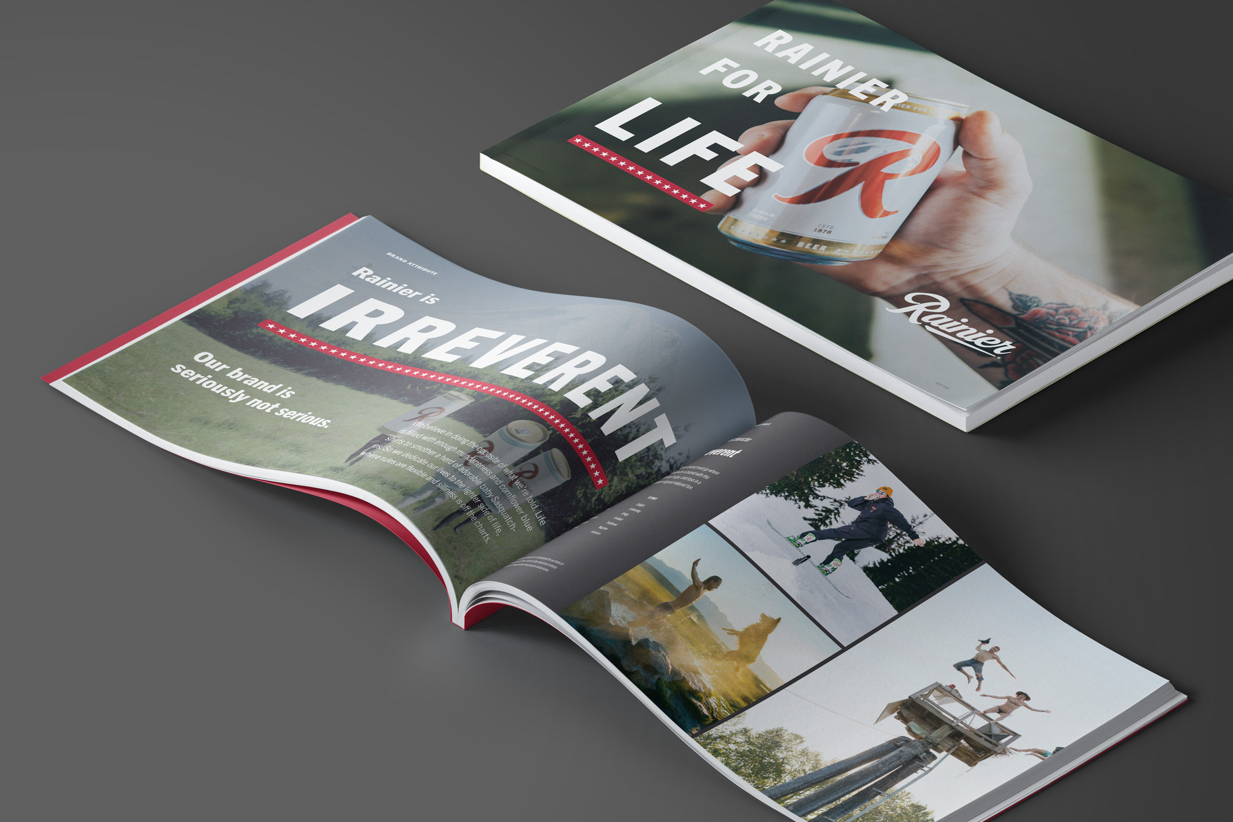

Identity & packaging backed with strategy
Rainier trusted us with updating their most iconic asset, their logo with the big red R. Their brand strategy and identity then informed their new packaging design system. Check out the case study about Rainier packaging.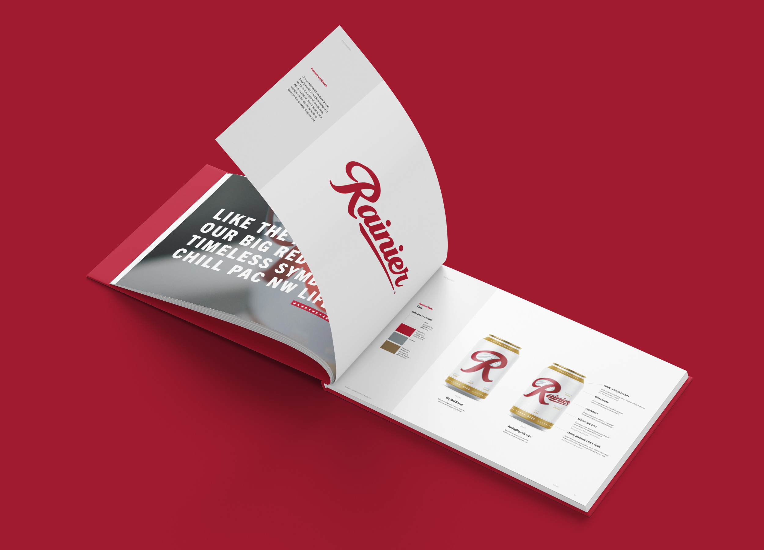
A classic reimagined.
It’s scary when changing up a classic, but when it’s done with respect, it can be a huge leap for the brand. Thanks to Rainier for taking that leap like a man in a Speedo jumping into a cold river on a hot summer day.
Team
Made while working at Parliament.
Calvin Ross Carl, Creative Director & Designer
Aaron Noah, Producer
Scott Snyder, Photographer
Calvin Ross Carl, Creative Director & Designer
Aaron Noah, Producer
Scott Snyder, Photographer
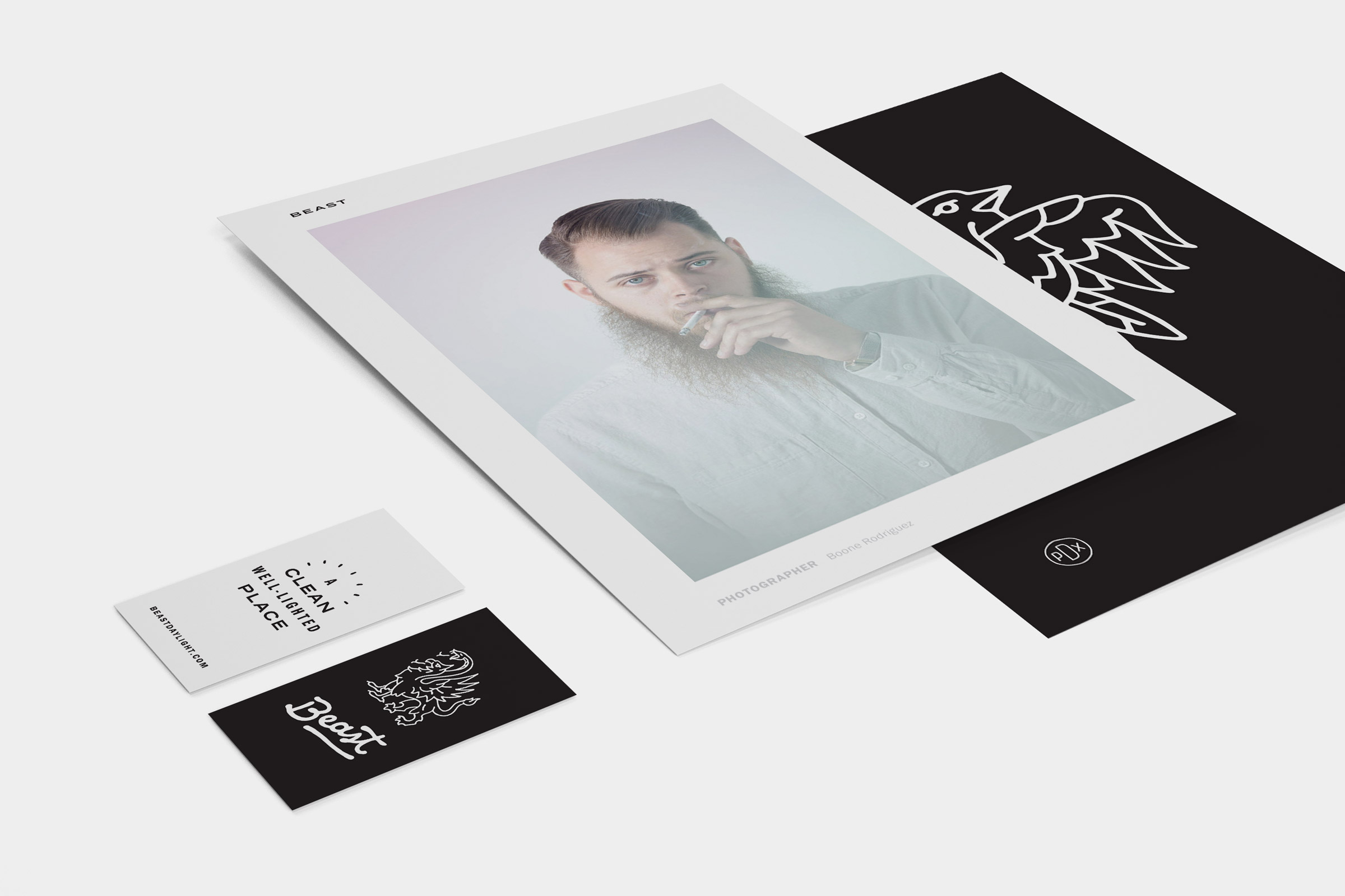
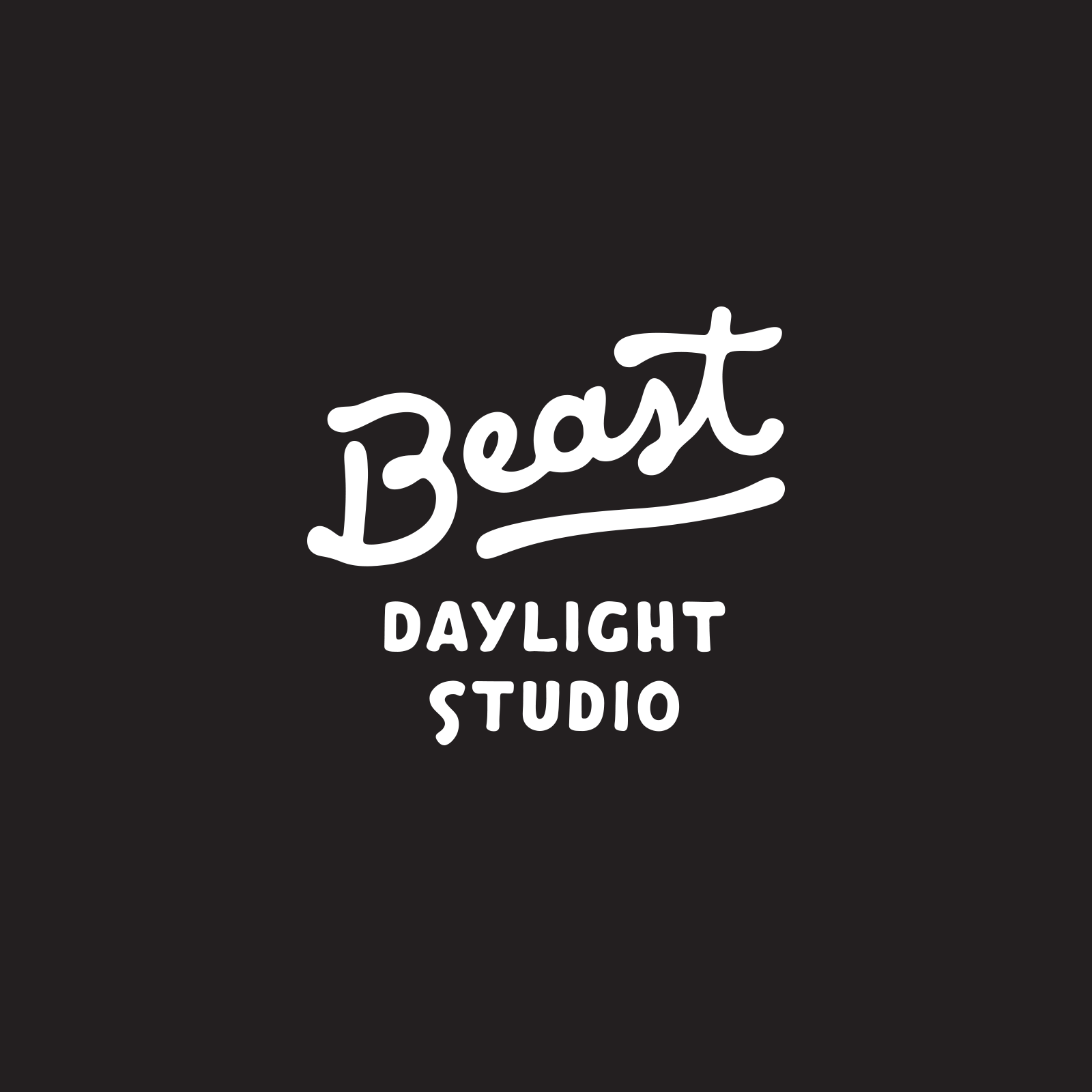
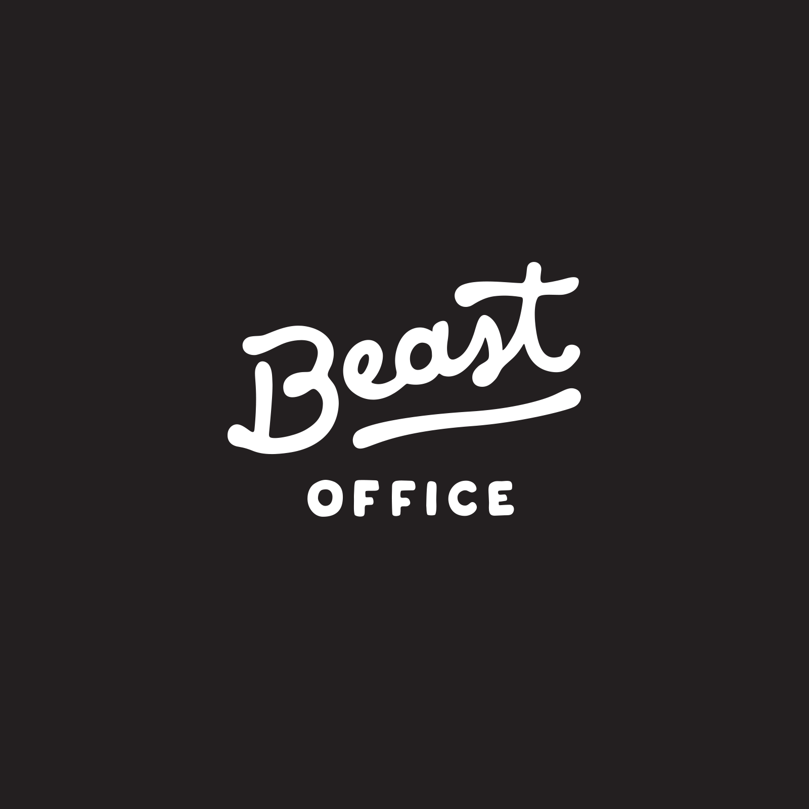
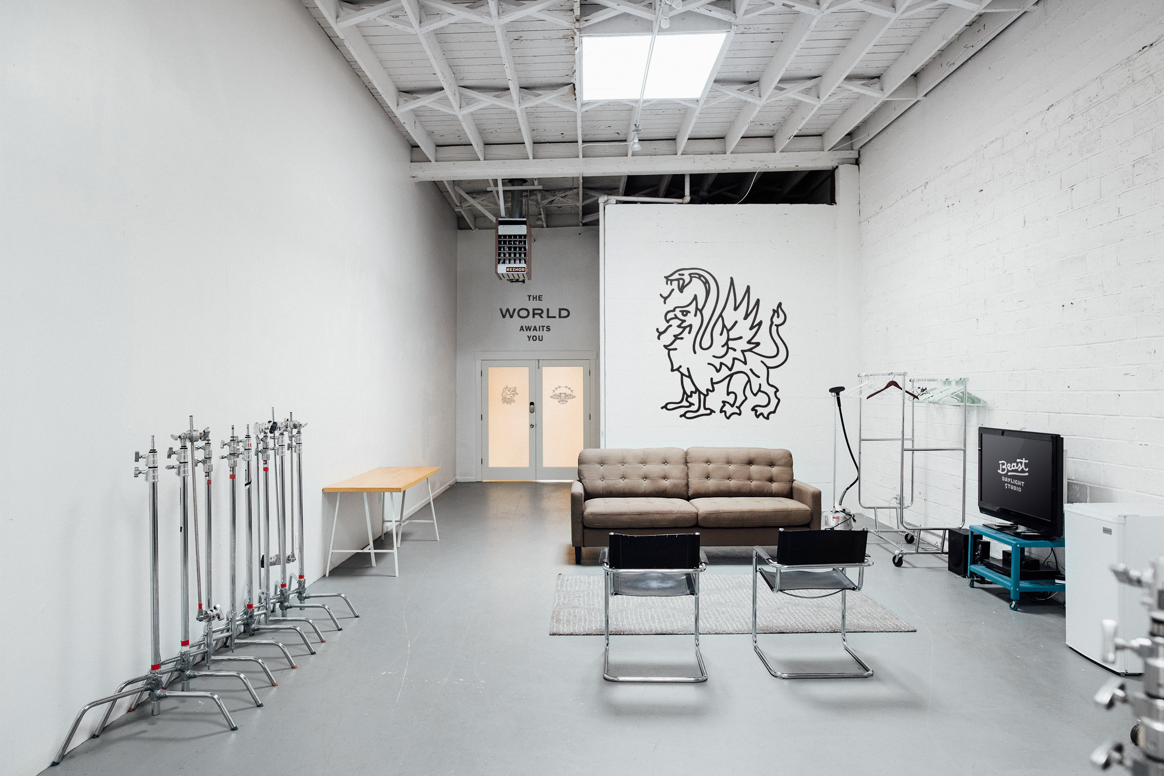
Beast
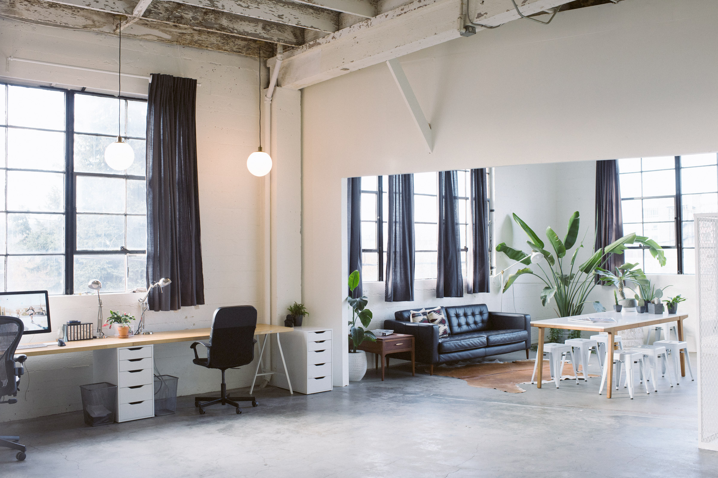
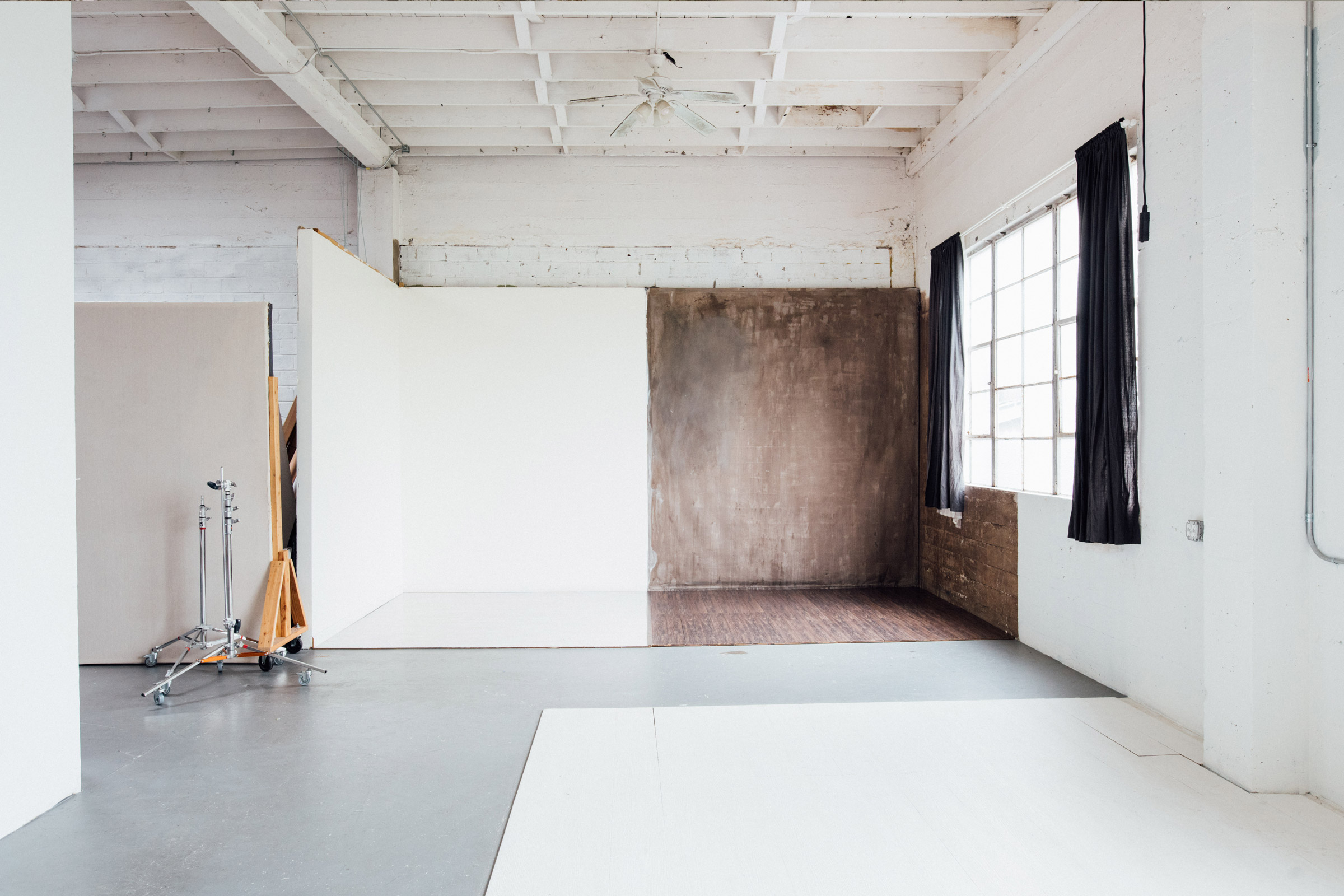
Beast is an easy to use photo studio filled with beautiful daylight. They also host coworking offices and events for the advertising and design industry.
Branding
Identity
Design
Messaging
Illustration
Environmental
Identity
Design
Messaging
Illustration
Environmental
Beast founder and photographer Boone Rodriguez wanted to build a special daylight photo studio for his peers in the industry. We found Beast’s competitors to be corporate and forgettable. To rise above the rest, Boone needed a brand his peers would respect and never, ever forget.

A mean brand for a clean space.
The Beast brand was intentionally designed to bring small touches of attitude and charm to its minimalist space.


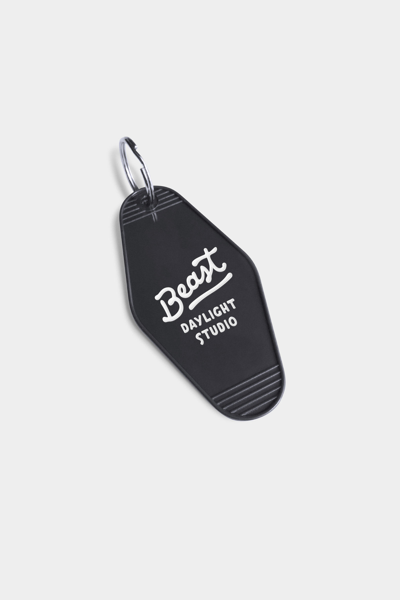
Brands for the studio, office and talk series.
Beast rents out office and event space, so we developed specific sub-brands depending on Beast’s target audience.
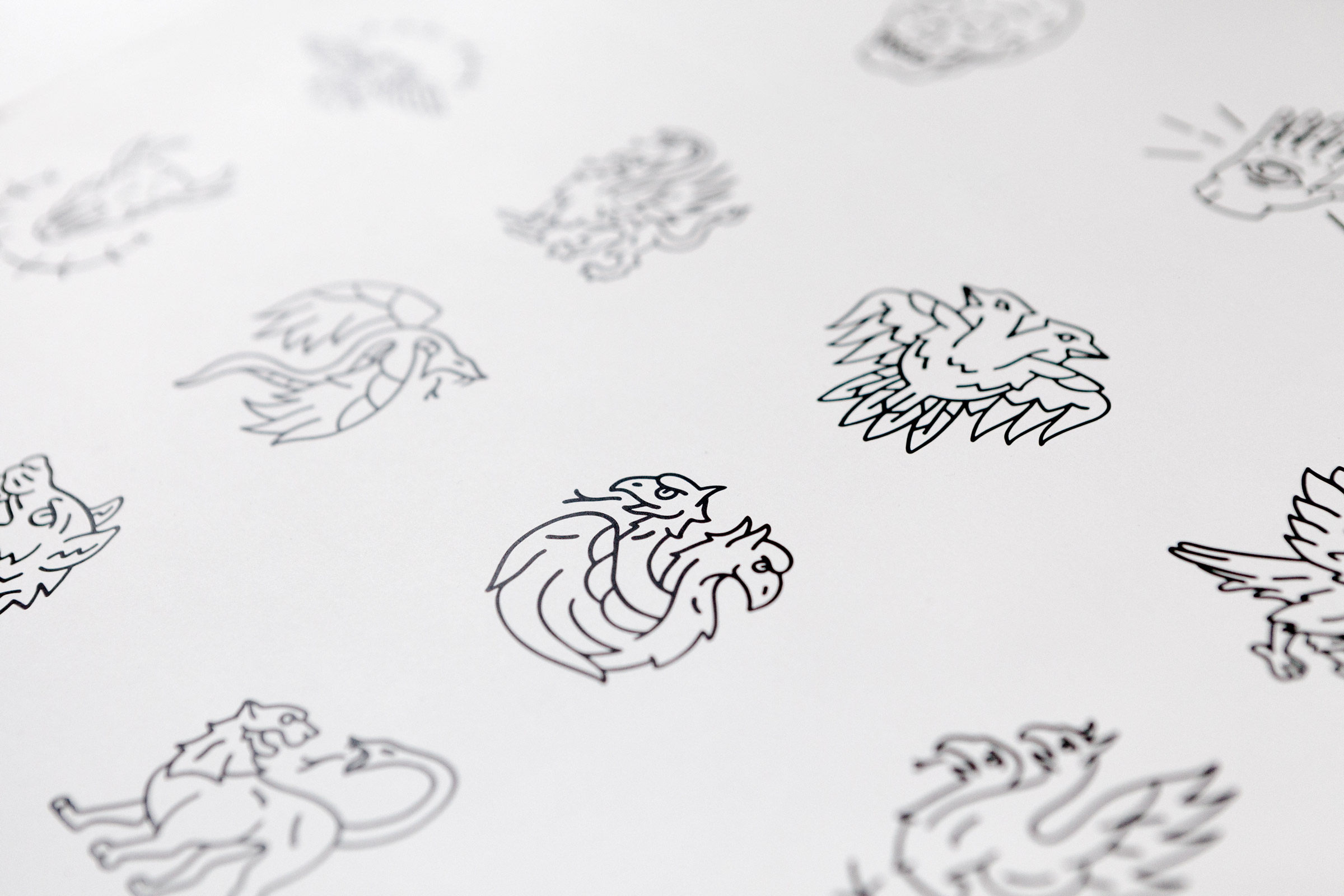
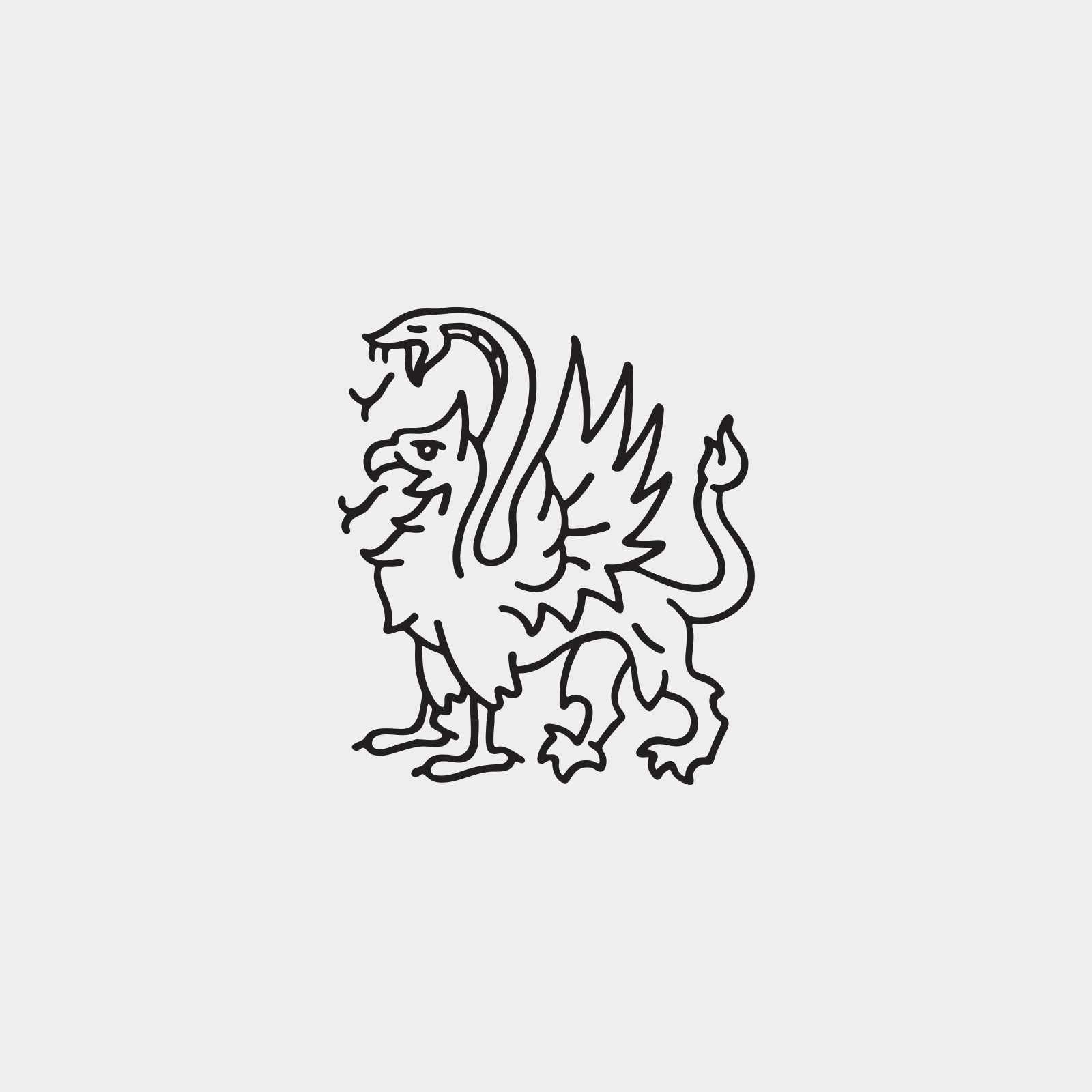
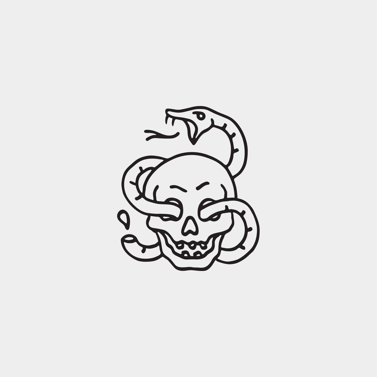
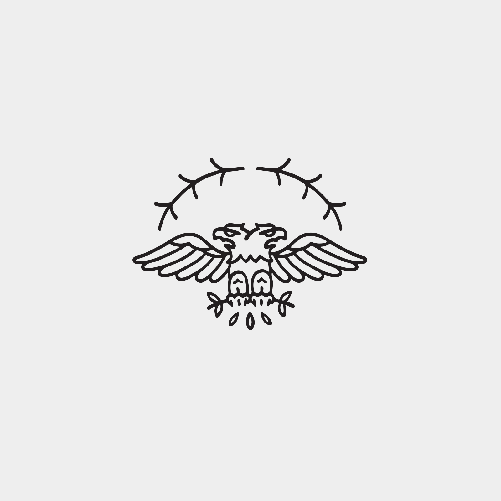
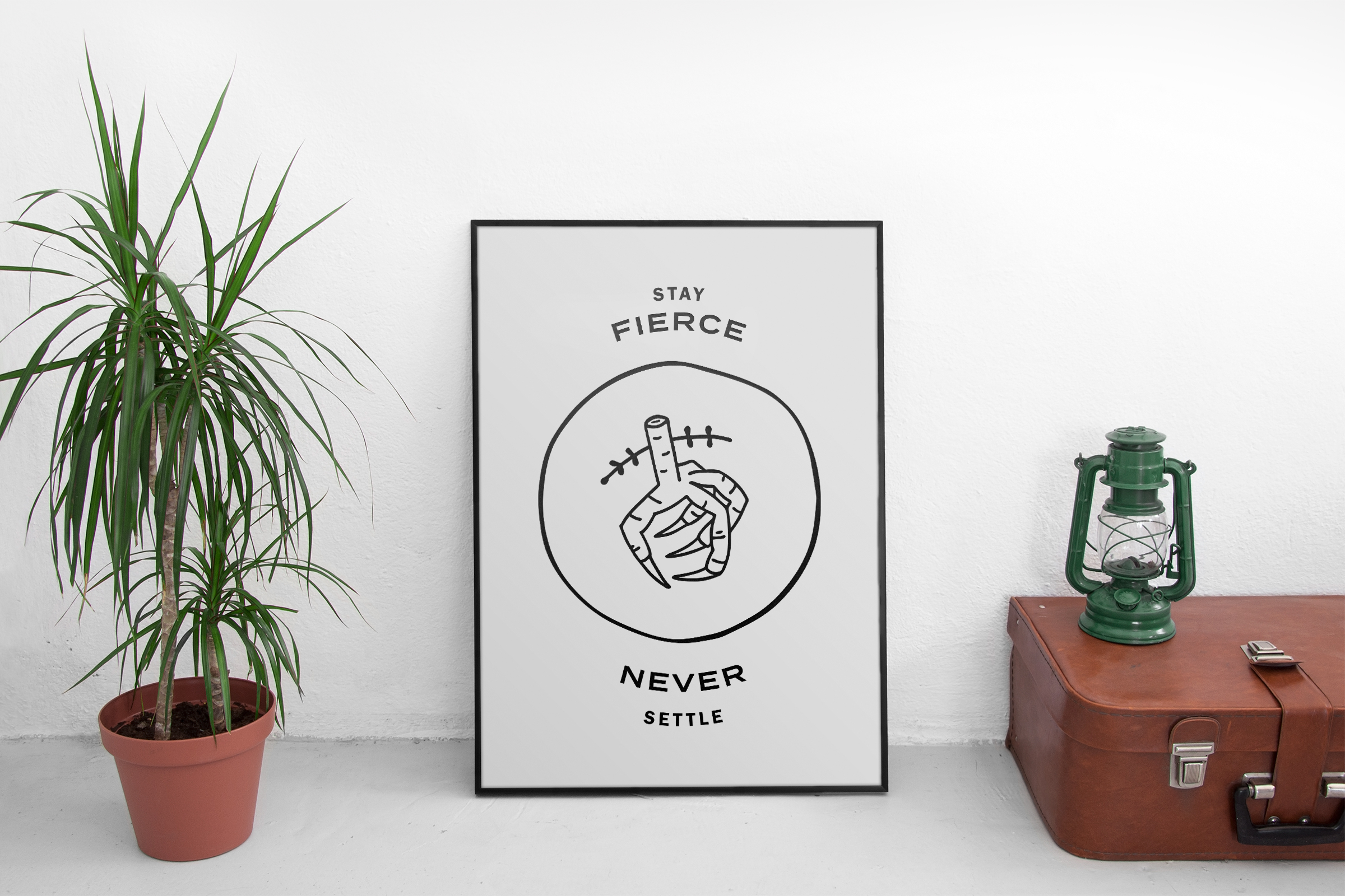
100+ hand drawn brand elements.
I created custom illustrations until my hands were numb. Each was inspired by a mix of mythological beasts and classic American tattoos.


Bringing attitude to the space.
Custom illustrations were used as a wayfinding system throughout Beast’s many spaces.

“Honestly I think it's perfect. You knocked it out of the park. Thank you.”
Boone Rodriguez
Owner & Photographer
Unleashing the Beast
Beast has launched to huge success. Their calendar is already packed with studio rentals and events for the community. Congrats to Boone and Beast for building a brand with an attitude.
Team
Made while working at Parliament.
Calvin Ross Carl, Creative Director, Designer & Illustrator
Chelsea Spear, Producer
Boone Rodriguez, Photographer
Calvin Ross Carl, Creative Director, Designer & Illustrator
Chelsea Spear, Producer
Boone Rodriguez, Photographer