Rainier Brewing Branding
Rainier has been the crushable beer of choice for Pacific Northwesterners for over a century.
Branding
Identity
Design
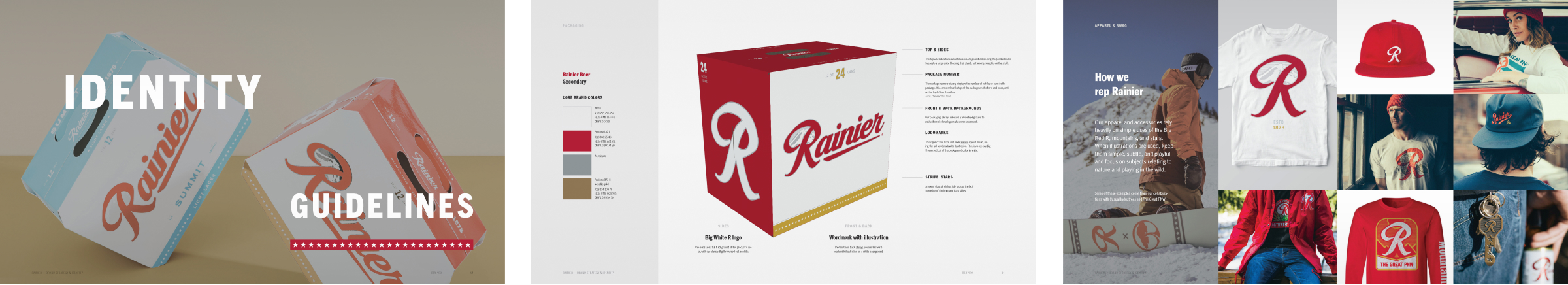
Packaging
Brand extension
Identity
Design
Packaging
Brand extension
To ensure another century of dominance and carefree thrills in the outdoors, Rainier refocused their brand on what makes them great—being a carefree drink that gets your ass out of the city and into the outdoors.
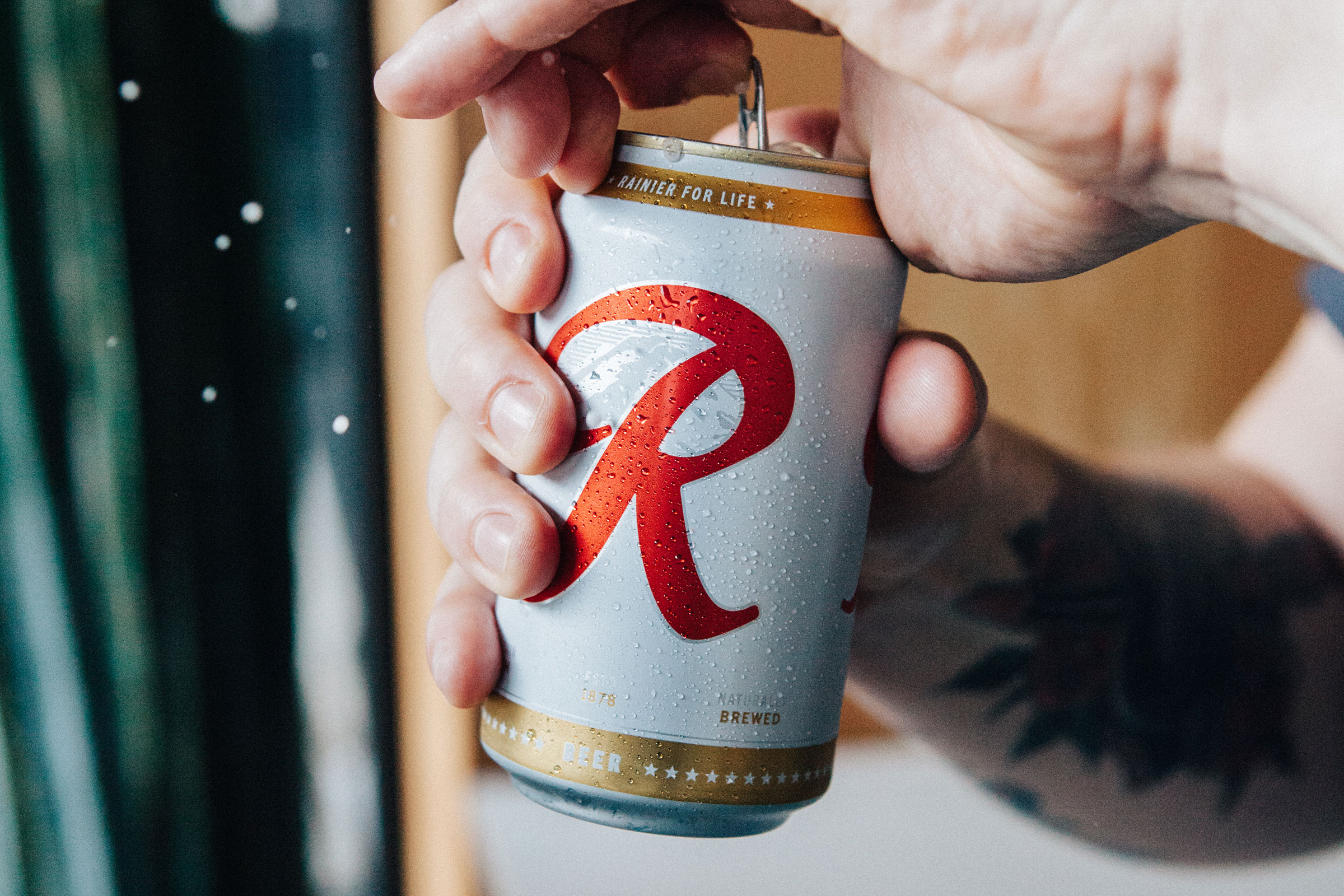
The Big Red R is iconic
There is only one rule: do not fuck with the Big Red R. It’s been there since day one, and it’ll be there when we’re all dead and gone.
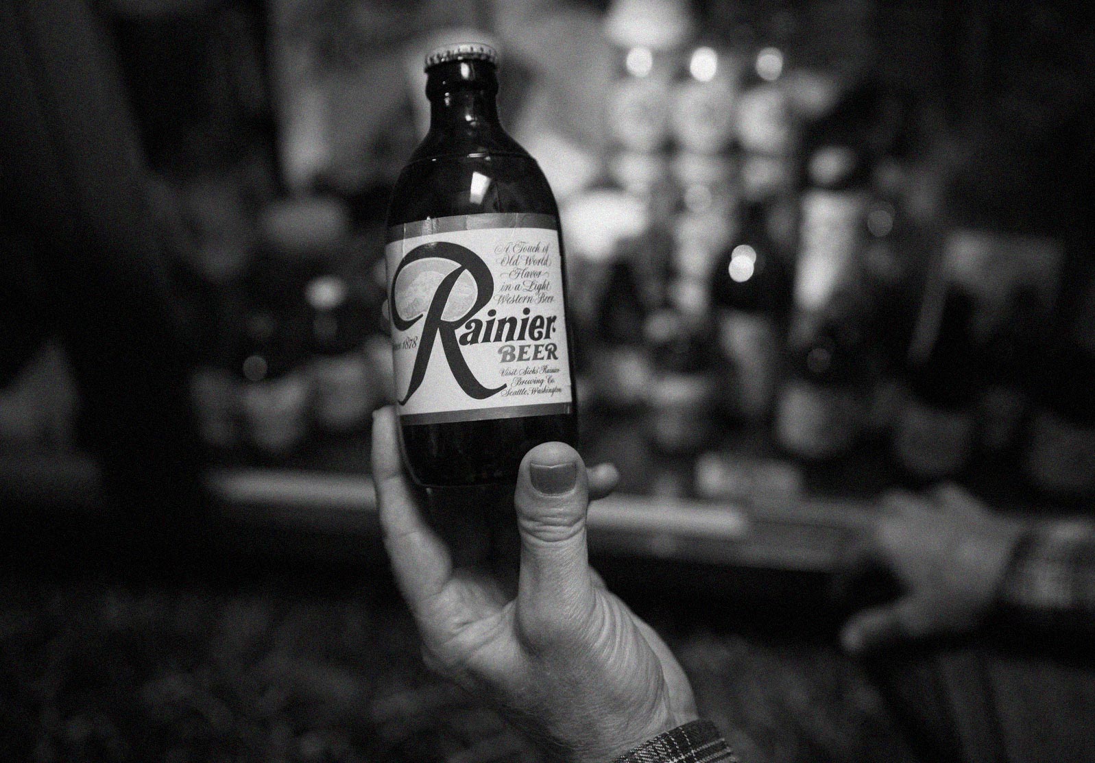
The 1960s Rainier stubby
New siding on an old house
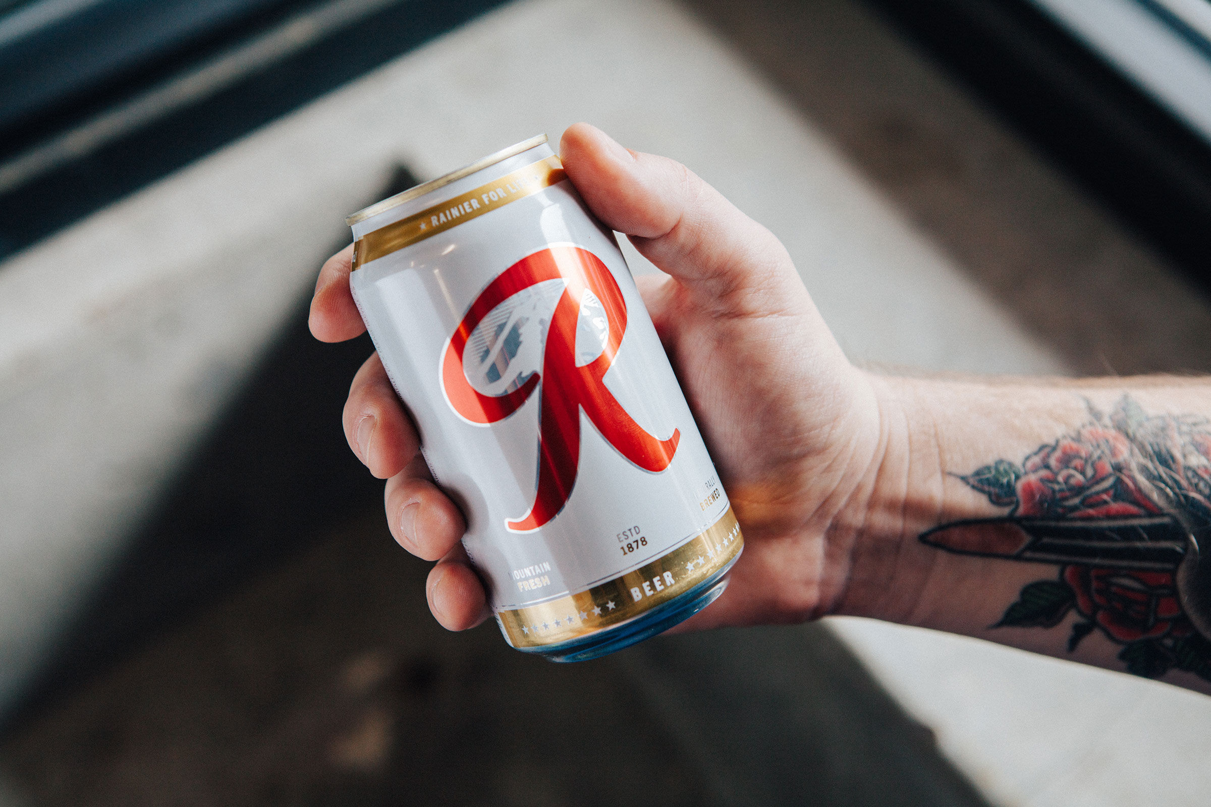
So the Big Red R stayed, and the logo was changed to feel like a modern version of the classic beer it has always been.
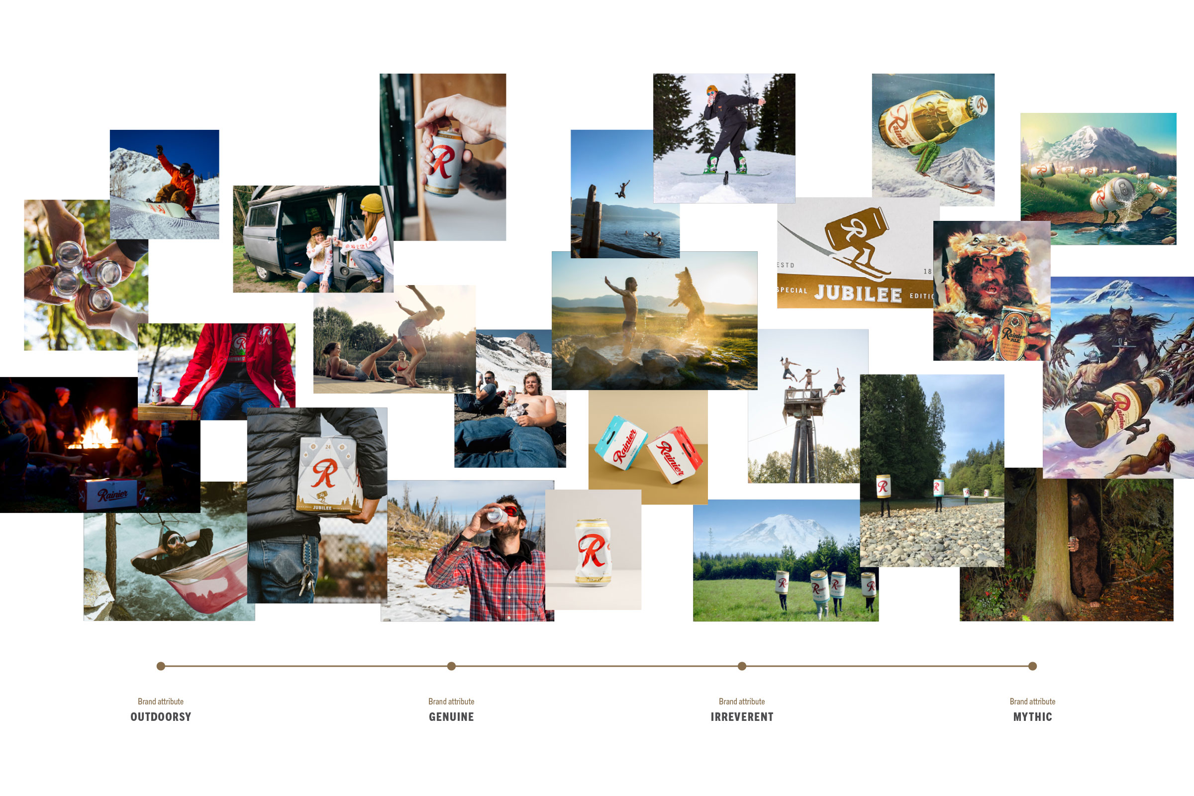
Seriously not serious brand attributes
As long as we’re breathing, we better be outside and we better be laughing. So we built a brand that is genuine and irreverent to its core.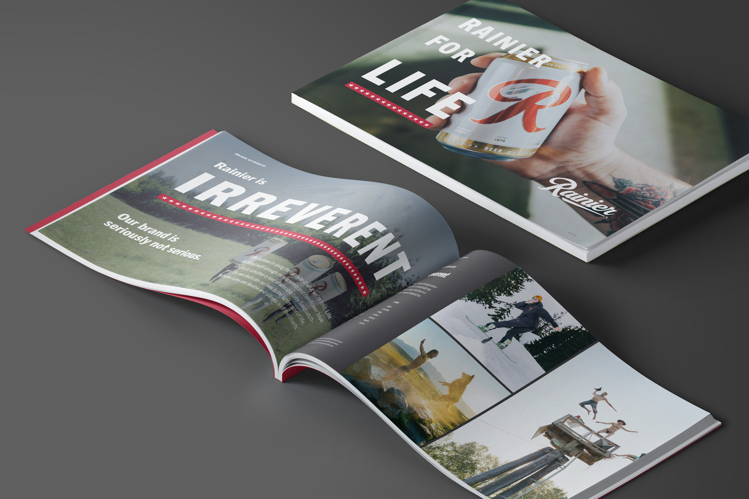

Identity & packaging backed with strategy
Rainier trusted us with updating their most iconic asset, their logo with the big red R. Their brand strategy and identity then informed their new packaging design system. Check out the case study about Rainier packaging.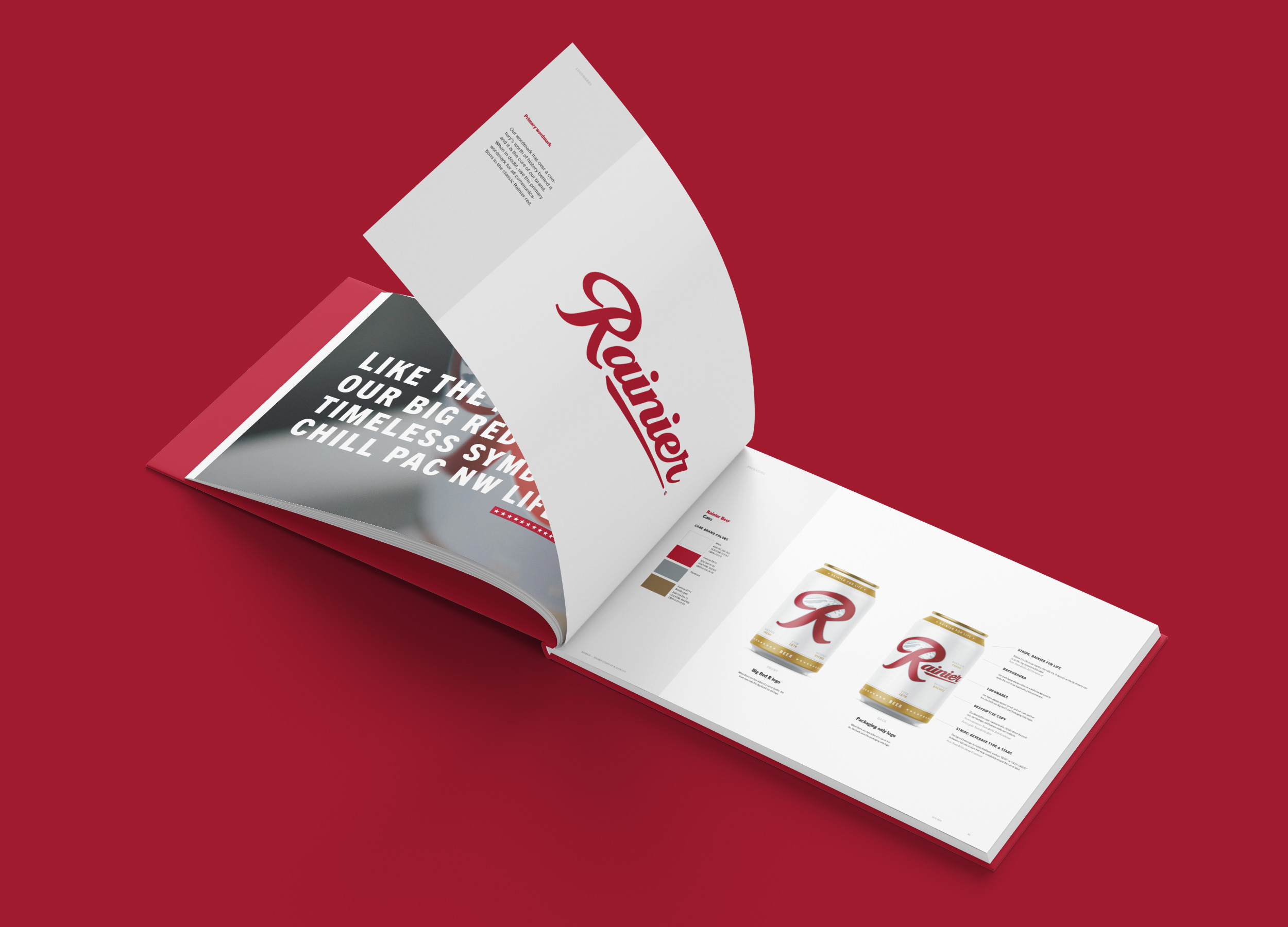
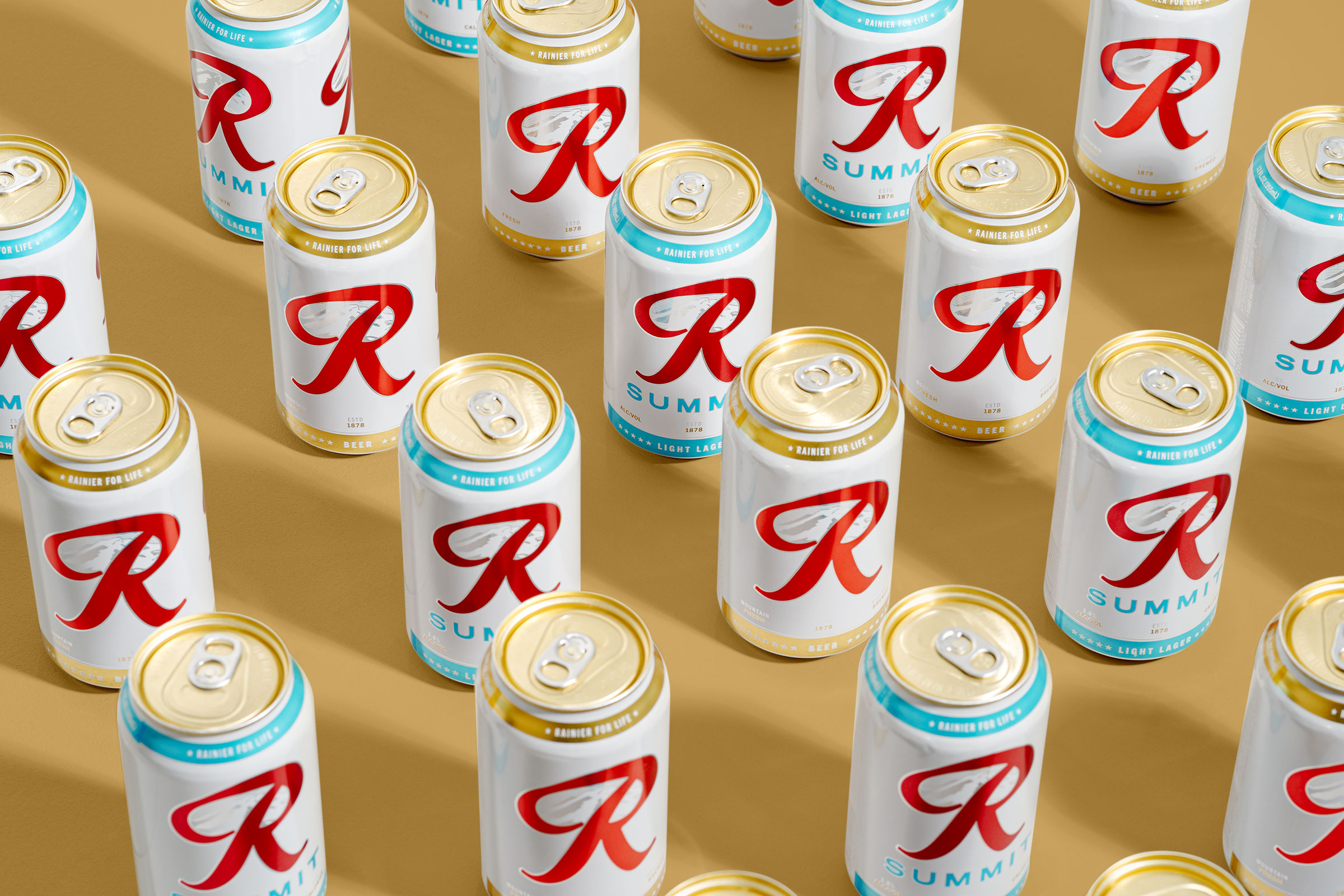
A classic reimagined.
It’s scary when changing up a classic, but when it’s done with respect, it can be a huge leap for the brand. Thanks to Rainier for taking that leap like a man in a Speedo jumping into a cold river on a hot summer day.
Team
Made while working at Parliament.
Calvin Ross Carl, Creative Director & Designer
Aaron Noah, Producer
Scott Snyder, Photographer
Calvin Ross Carl, Creative Director & Designer
Aaron Noah, Producer
Scott Snyder, Photographer